| PART I: YOUR FACE | |
| Step 03: Making Your Picture Blue |
open online photoshop Back to homepage |
| PART I: YOUR FACE | |
| Step 03: Making Your Picture Blue |
open online photoshop Back to homepage |
 Before
we go any further, let's take a quick second to learn a little about how
computers think about color.
Before
we go any further, let's take a quick second to learn a little about how
computers think about color.
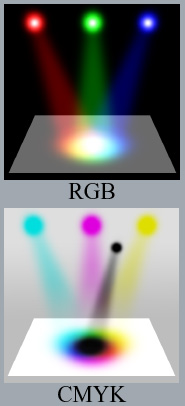
While there are hundreds of millions of different colors in nature, the human eye can only distinguish a few million (anywhere between 3 and 10 million depending on the person) because our eyes compress visible light into three primary colors: red, green, and blue. So, when we designed movie projectors, televisions, computers, monitors, etc. we only worried about reproducing the colors we can see, and not about reproducing colors in their true nature.
There are two basic ways of reproducing color:
Keep in mind that RGB color is best for viewing graphics on a computer monitor while CMYK color is best for creating printed graphics.
All of this is leading us to the fact that ToolPic works with RGB color (well, ToolPic actually works with sRGB color, but the s just stands for Standard), which is great because we will be viewing our image on a computer and not printing it.
Okay, back to our picture. We want to change the color of the picture so that it has a blue tint so that when we begin creating the line work (which we will do in black) we will not be confused by the colors in the picture.
If your
Face image
is not open, open it in ToolPic now; this is the image I will be using in this
Picture editing help...
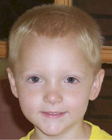
I know...he's a stud
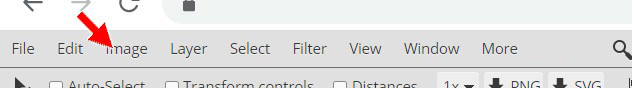
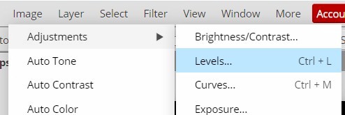
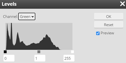
To give our image a nice blue tint, we need to work with colors within RGB. We first need to get up the Levels editor.
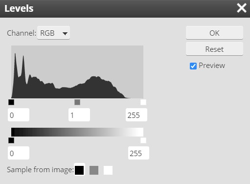
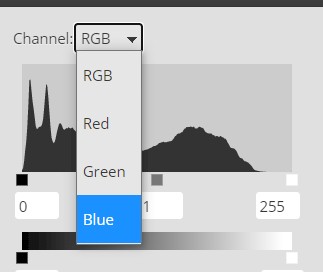
Before we make any changes, let's look at how the Levels editor functions. The Channel selector at the top tells whether you are working with red, green, blue, or all of them at once (named RGB, the default selection). ToolPic keeps separate level settings for each of these four channels. The histogram (that black mountain looking thing under the Channel selector) tells you how common shades of the selected channel are, ranging from 0 (dark) on the left, to 255 (bright) on the right. Since we are working with a full-color Best free photo editor online, the graph should show a large amount of black, as in the screenshot above (since you are working with a different image your graph will not look exactly like mine). If our image had only a few colors, or was black and white, we would see a much smaller amount of black in the graph.
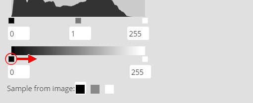
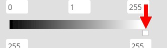
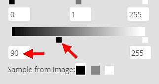
The main controls in this panel are the three boxes under the graph (see Image 1 below) which control the Input Level, and the two boxes under the gradient below them (see Image 2 below) which control the Output Levels. The input arrows define where black, white, and 50% gray are on the scale. The output arrows define how white the brightest white can be, and how dark the darkest dark can be.
 Image 1 |
 Image 2 |
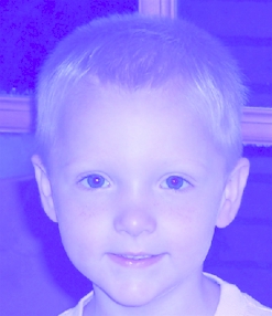
If you have changed the levels in a way (and you should NOT have, but if you did...), hit "Cancel" and then get the levels editor back up again. We're going to use the levels editor to turn the picture a light blue. We do this because the dark colored picture can obscure some of the details of the black ink that we will be drawing with, and dark smudges cannot slip by as easy if they don't blend in with the picture color.
Here is how to make yourself blue.

You should now be blue! You can now fine-tune your image to get a shade of blue you are comfortable working with.
YOU SHOULD BE
BLUE AND NOT
PURPLE OR
GREEN OR
LIGHT BLUE or any other color!
It should look something like the image above - if your image is purplish or greenish or light bluish then close your image without saving and reopen it and start over and be sure you are working with the correct channel when you make your changes.
I should probably point out that there are other ways, even easier ways, to turn the picture blue, but it will help a lot if you familiarize yourself with the Levels editor, which can be very useful at completing other tasks, such as brightening a final picture that is too dark. Keep in mind that your shade of blue does not have to match mine (in fact, when doing this on your own at some future time you can actually make the image any color other than black that you like), you just want the image a color other than black so that you can see the lines when you begin drawing them in.
Let's save our image at this point so we can begin creating the lines in the next step.
01 | 02 | 03 | 04 | 05 | 06 | 07 | 08 | 09 | 10 | 11 | 12 | 13 | 14 | 15 | 16 | 17 | 18 | 19 | 20