
Today we will talk about 10 taboo mistakes in typography:
1. “Seppuku”
“Seppuku” is a taboo in newspaper typography, referring to a thin line running through the left and right ends of the picture. This cuts off the overall contextual flow of the picture, making it difficult for the introduction to move forward smoothly.
Drawing a line can indicate that the upper and lower parts are two different categories, but if the line runs through the left and right, it will cut off the line of sight. Shortening the length of the line makes the upper and lower parts coherent.
The text crosses the left and right, which will affect the lead, so you should shorten the left and right width of the article as much as possible, and if the text is too long, put it at the low end of the page, which is more convenient for the lead.
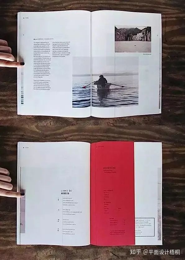
2. “Tears Goodbye”
When we look at a magazine, we often see a full stop at the end of the page. The reader may think that this article is over, close the book, or skip to another page. This is called “tear goodbye”. So, if the article isn’t finished, it’s best not to let the full stop appear at the end of the page.
Similarly, placing the caption of the image far away from the image can also cause inconvenience to the reader’s introduction, so avoid it as much as possible.
If the article is not over and the page ends with a full stop, the reader will mistakenly think that the article is over. So try to adjust as much as possible and don’t let the full stop be the last character on this page.
The picture is so far from the caption that we call it a fault. Readers prefer to place the description next to the picture. The concept pursued by the design should be the convenience of the introduction.
3. Overfilling
Customers always want to have a variety of content in one page. However, when there is too much information, it will make people feel that they cannot find the point and cannot achieve the purpose of the design. We usually think of a picture with too much information as overfilling. The disadvantage of overfilling is that there is no sense of space at all, which will dazzle the reader, and the line of sight will actively avoid. So designers must make effective use of white space.
There is too much information to fill in, and there are almost no blank spaces left in the picture. In this case, the reader will not know what to do, so it is better to keep the content down moderately.
It’s not an exaggeration to say that designers are tasked with trying to create as much space as possible. Leave some blank space on the screen to make it easier to lead the sentence. Ease of introduction will ultimately make the reader receive more information.
4. Welting
The image fits snugly to the bottom edge of the frame, which we call the welt. Images have a certain sense of weight, and if they are placed on the lower edge of the picture, they will upset the balance of the picture and make the reader feel anxious. In visual psychology, the lower edge of the picture is like the earth of heaven and earth, neither too light nor too heavy. To avoid this, you can match the image against the baseline of the article, or move the breakout upwards.
If the image is placed at the bottom of the frame, it will make the picture look heavy, unbalanced, and make the reader feel anxious. Moreover, the subject of this image is the sky, which is very incongruous when placed at the bottom of the frame.
To avoid welts, you can align the image with the baseline of the text below, or move the image up. In this way, a sense of spatial rhythm is created, which facilitates the introduction.
5. Black is an escape color
When black is used as a background color, any color can become eye-catching. Black is colorless and is able to accentuate color. Black always feels cold. But in fact, we usually choose black when we don’t know which color to choose, which is the choice that people make when they escape. Therefore, it can be said that people who choose black as the background color are actually people who don’t know how to embellish.
A black background can actually cause eye fatigue. From a practical point of view, we should avoid black as much as possible.
Black can really make pictures and text more eye-catching. But this strong color contrast can cause us a lot of visual pressure. Anyone can use black, but it’s hard to find a color to go with it.
The contrast effect on the black background is too strong, and in order to ease the contrast, we can increase the brightness of the picture. Green is used as the background color here, which reduces the contrast between the background color and the text of the picture, which is convenient for the introduction.
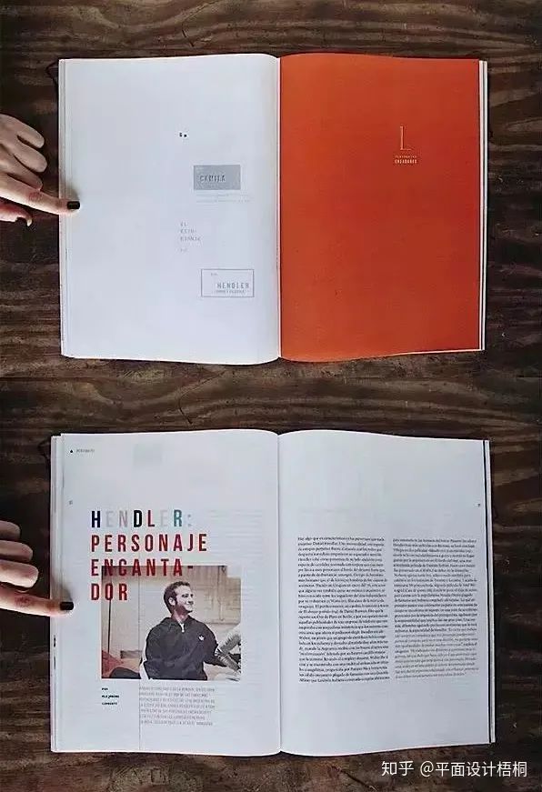
6. Too many frames
When there are multiple categories of content in a design layout, we need to group them by different categories. There should be no more than three groups of flyers or posters. If there are too many, the line of sight will be distracted.
When categories are hard to tell and people want to highlight content, a lot of borders are applied. However, if there are too many frames, the picture will lose its unity. It’s hard to move your gaze smoothly.
Borders are a technique used to highlight content. In a pair of pages, the frame must be no more than three, and only two places should be used as much as possible, so that the effect of the border can be played.
Controlling the bezel in three places can bring the complex picture back to tranquility. And the most important thing about this picture is that there is a large box in the upper right corner.
7. Uneven
Jawry means that the headlines of posters, flyers, and magazines do not align with the initials of the text. This is often seen in informal posters, but this problem never appears in front of the poster.
Why can’t it be uneven? Because it affects both the lead and the aesthetics. Among the four techniques of layout design, there are left-aligned, centered, and right-aligned, but they are never uneven, and it is easy to understand from this point of view.
We sometimes want to misalign the title and the body letters, but this will make the picture messy and unaesthetically pleasing, and affect the lead. So we should try to avoid unevenness.
Draw a baseline to keep the picture neat and organized. If you snap to the left baseline, you are left-aligned; Aligned to the centerline, that is, centered.
8. Pattern text
Words are mainly used for introductions. If you want to use it as a logo, you can decorate it to a certain extent, but if you decorate it too much, it will affect the readability. Text is beautiful even if it is not decorated, and decoration should be the function of illustrations and pictures.
If you over-decorate the text, it will become difficult to read. We call this a reduction in readability. Words are not decorations, but introduction tools, so don’t overdo it.
If the text is not processed, it will not become a pattern text. Try to keep the original form of the text as much as possible, and if you must use patterned text, you must choose a suitable font.

9. “Chimney”
If you take a picture in a vertical row, you call it a “chimney”. Such a design may seem unifying at first glance, but if it is too neat, it will lose the visual stimulation and make the reader feel bored. So chimney shapes should be avoided as much as possible.
Stagger the picture slightly so that it has a certain rhythm and looks as dynamic as a wave. This sense of rhythm stimulates the brain and makes it exciting.
In a hinge, two lines of pictures are inserted vertically, the so-called chimney, monotonously lacking stimulation. This should also be avoided in the catalog.
Staggering the pictures and breaking the straight line is called disrupting the rhythm. Disrupting the rhythm creates a sense of rhythm that brings the picture to life and excites the reader.
10. “Intrusion”
The image is forcibly stuffed at the bottom of the page, which is called “invading”. In this way, the word count of the line above the picture will be reduced, making the article very incoherent and affecting the lead. Ease of introduction is always a fundamental idea in design.
It’s best if the image doesn’t fall to the bottom edge of the page (welt). Because this will make people feel that the picture has been thrown out of the picture and cannot be integrated into the picture.
The image in the lower right corner seems to be “invading” the text. There are only a few words left in the upper lines of the picture, which looks fragmentary. This is not convenient for the introduction, and the picture cannot be integrated into the picture.
Move the image slightly and put it in the middle, and the article will also become compact and easy to lead. In this way, the picture becomes a major element of the picture composition and is well integrated into it.
ˇ
The four basic principles of typography design are contrast, repetition, alignment, and intimacy
contrast
The basic idea of contrast is to avoid overly similar visual elements on the page, such as fonts, colors, sizes, line weights, shapes, spaces, and so on.
Contrast is often the single most important factor in making a page stand out, and it’s what makes it the first thing the reader sees. Enhance the effect of the picture, but be careful, do not contrast too strongly, in the use of color, the color contrast is too strong, it may cause the opposite of the extreme.
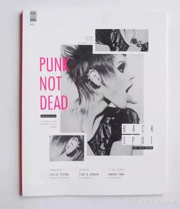
Taking the above picture as an example, 100% and 22 account for a large proportion of the picture, and the contrast of font size is very strong, so it creates a strong visual impact. It’s easy to get the reader’s attention, isn’t it?
repeat
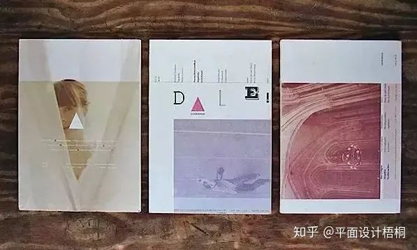
Repetition refers to the reuse of some basic elements in page design, including color, shape, material, spatial relationship, line weight, font, size and image, as well as some geometric elements, etc. In this way, it can increase the organization and integrity of the picture.
In the above case, the principle of repetition is used in the use of color, the size and placement of the picture, the size and type of font, and the use of basic elements, and we feel that the whole case is very unified and harmonious visually. As a reminder, in terms of typography, there should be no more than three types of fonts, on a single page.
align
In the design of the page, each element should have some kind of visual connection to the other element on the page so that a clear structure can be established.
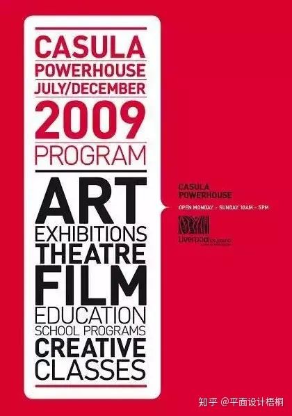
Common alignment methods include left-alignment, right-alignment, center-alignment, etc. Center alignment is rarely used, and it is not recommended for everyone. When designing the layout, you must find a certain connection and find an alignment line
In this set of designs, left-alignment is used for a large part of the text, and the overall effect is clearly structured.
Intimacy
Intimacy is simply to classify the elements in the picture, and make each category into a visual unit, rather than a multitude of isolated elements. Keep the page organized and organized, but also be careful not to leave too much space in the picture… And there must be some kind of connection between the visual units.
summary
The 12 taboo misunderstandings and the four basic principles of layout design are very simple to elaborate, but there is still a certain degree of difficulty in the actual application to the design, we must fully understand and experience the essence of the 12 taboo misunderstandings and the four basic principles, and continue to practice to design a visually good layout!
Please indicate:Free Editor Online Photoshop » Today we will talk about 10 taboo mistakes in typography

 Gender Double Label Revealed 9 Illustrations Reveal the Invisible Rules Around Us!

Login to comment! If you already have an account, please first log in,No please registered or