
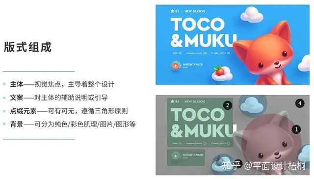
First, the layout composition
Subject: The visual focus, which dominates the whole design (can be people/objects/text/pictures), and the most attractive part of the whole layout, which is equivalent to the role of the protagonist.
Copywriting: Auxiliary explanation or guidance for the main body, after all, sometimes we put a little fox next to it, and the user can’t know exactly what it is talking about, the role of the supporting role.
Embellishment elements: decorative elements, dispensable, according to the needs of the layout; good embellishment elements can render the atmosphere, most of the embellishment elements follow the triangle principle, similar to the clouds in the figure below, the role of group performance.
Background: It can be divided into solid color/color texture/picture/graphic, etc.
2. Balanced composition
Balance is an important way to achieve unity in design. If the elements mentioned above are combined in a balanced state, then the design will look unified and will give an overall impression. Therefore, balance is an important aspect of visual communication design. There are 3 classifications of typography balance, which are: symmetrical balance, asymmetrical balance, and overall balance.
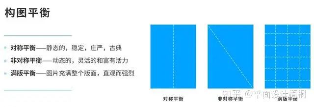
1. Symmetrical balance
Symmetry is the balance of equal quantity, and symmetrical design is a static, predictable, organized and balanced layout design. Symmetrical compositions are relatively easy to create and are characterized by stability, solemnity, neatness, tranquility, serenity, and classical.
2. Asymmetrical equilibrium
Asymmetry creates order and balance between unequal elements, and asymmetrical design changes space because the layout is unpredictable. It is characterized by being dynamic, flexible and dynamic. There are many asymmetrical compositions, and there are the following 6 common forms.
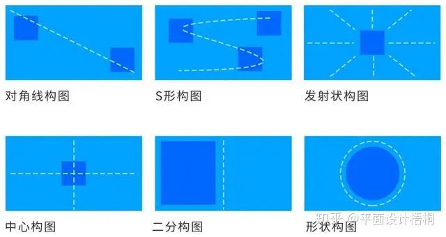
Diagonal composition:
The text is placed diagonally in the direction of the layout, on the one hand, it avoids the commonplace center layout, on the other hand, it leaves more creative space for the center subject, and the center graphic can also be designed diagonally, which will make the whole composition look more balanced.
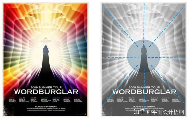
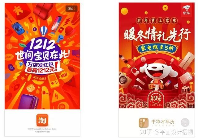
Emission Composition:
The embellishment elements are emitted around the text or graphic in the center, and this composition will make the visual focus of the center easy to focus on, and the visual impact will be stronger.
For example, e-commerce promotions, Taobao and JD.com often use emitting compositions to create a lively level of excitement for major promotions.
Center Composition:
This is one of the most common compositions in this area, with the copy and body centered on the page, and the attention is to make the body in the center of the page as brilliant as possible, using design techniques to attract the reader’s eye, so as to avoid being dull and boring.
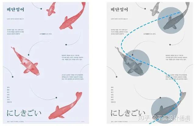
S-shaped composition:
The copy or graphic is placed at the place where the line turns, and the whole is in an S shape. In addition, the starting point and focus of the line are also easy for the reader to pay attention to, and some important information can be placed. The composition is flexible, fun, and guides the user along an S-shaped trajectory to read the message.
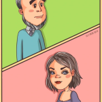
Dichotomy Composition:
The copy and the subject are separated, in the form of a left-right or up-and-down composition, and attention should be paid to the principle of alignment. Such compositions are also relatively easy to create.
Shape Composition:
The combination of the subject and the copy can be in the form of a circle, triangle, rectangle and other shape compositions. Note that if you are using a triangle composition, it is best to have an inverted pyramid structure to make it easier for the user to move on to the next layer of information.
3. Overall Balance (Full Version Balance)
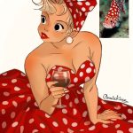
The overall balance refers to the fact that the picture fills the entire layout, and the copywriting layout is in the position of the top and bottom, left and right, and the middle, which is characterized by the main image as the appeal, and the visual communication is intuitive and strong. The full-page composition gives people a generous, stretched feeling. Note: This type of word processing can easily appear “noisy” during the design process, so in order to avoid crowded spaces, some text should be cut out appropriately.
3. Design principles
Now that we know the compositional form, we need to know some basic design principles, and while we can see them again and again elsewhere, I want to emphasize them here because they help us to know what the rules are before we break them. It is also important to note that these principles are not separated, but can be considered and combined at the same time, and are not the only options:
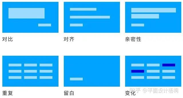
1. Contrast
Without contrast, the work becomes bland and does not convey the message effectively. Emmy Award-winning designer and founder of Blind Chris Do said that contrast is king, when used to guide the user’s vision and create focus on the page.
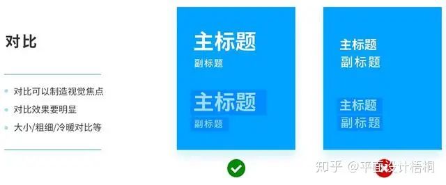
Generally, the methods of contrast can be: size contrast, thickness contrast, cold and warm color contrast…… No matter what kind of contrast, when you expect the contrast to be effective, you need to be bold and obvious, don’t compare the size of the 12 and 13 texts, it doesn’t make any sense, don’t cringe, it’s the same with design.
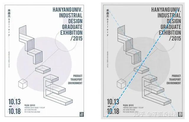
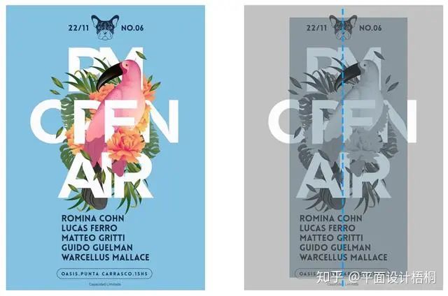
2. Alignment
No element can be placed on the layout. Each item should have some visual connection to something on the page. Find elements on the layout that can be aligned, even though they may be far away. One thing to keep in mind is to avoid using multiple alignments at the same time.
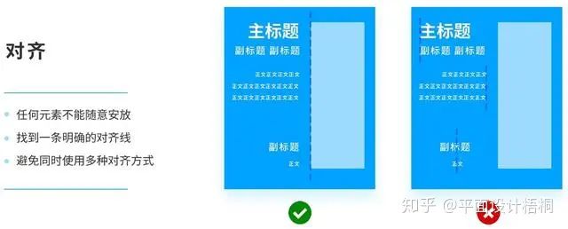
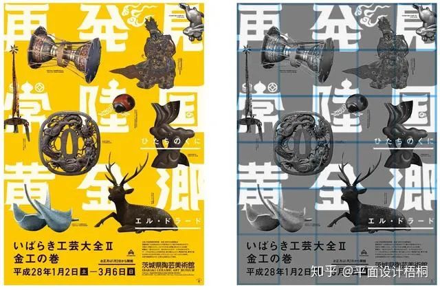
The poster on the left has a rectangular composition, and the poster on the right has a dichotomy composition, but the copywriters have found a clear and clear alignment line, which gives the layout an orderly beauty.
3. Intimacy
Similar to each other, distant, and related elements are close together, grouped together into a visual unit, rather than multiple isolated and scattered states, which helps to organize information, reduce confusion, and make the structure clearer. According to the content of the copy, reasonable grouping and classification are carried out.
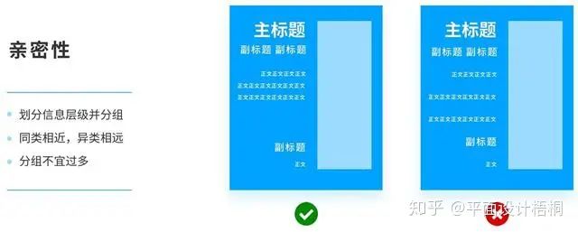
The poster on the left is divided into 4 groups, which are clear and organized, and the main body and embellishment elements in the center also make use of the principle of intimacy to make the central subject appear fuller, and the main body of the poster on the right adopts a launch composition, and the whole is in the form of an inverted pyramid, which is easy to guide the user to read the next layer of information.
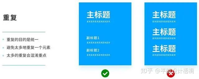
4. Repeat
The purpose of repetition is to unify and enhance the visual effect. For example, the headings are all the same font or size or weight. However, it should be noted that it is necessary to avoid repeating an element too much, which will only be annoying, and pay attention to the “degree” of repetition. Too much repetition can confuse the point, and all the focus equals no focus. In general, it is used as a background in a uniform and repeated pattern.
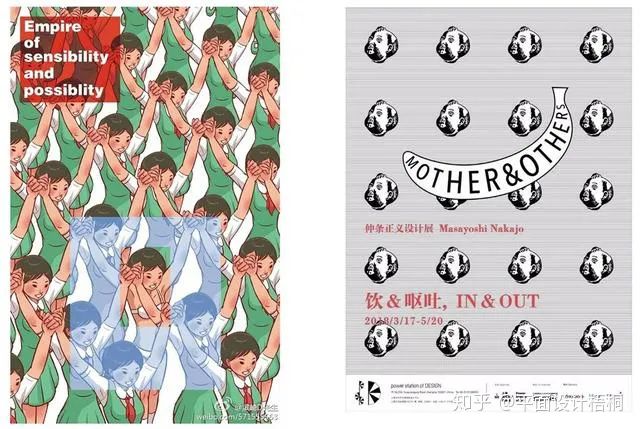
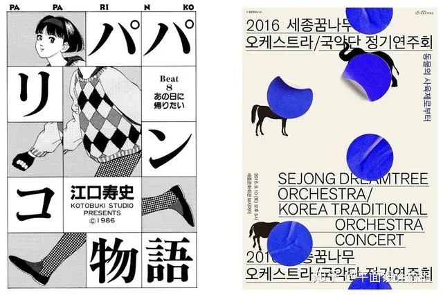
In the poster on the left, our eyes will be drawn to a different girl, this girl echoes the copywriting “Long live the sensitive word” in the upper left corner, and the difference in this homogeneity is the mutated element, which is used to create a visual focus.
The poster on the right is a personal exhibition poster designed by designer Kasai for the famous Japanese Nakajo Masayoshi, in which the repeated image is the image of a child with bulging cheeks, I don’t know whether he is drinking or spitting, this impactful image is actually echoing the theme of this exhibition “Drinking & Vomiting”, the designer wants to express Nakajo’s creation in life, just like this repeated image, constantly absorbing, constantly overthrowing, and finally constantly creating.
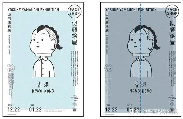
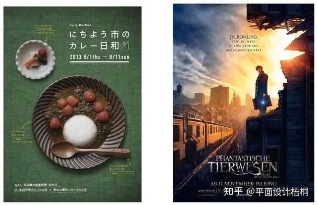
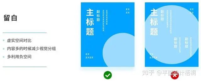
5. Leave white space
White space is the function of the contrast between virtual and real space. Proper white space allows the page to breathe, breathe, and give people a sense of comfort. When a large amount of visual information is piled up, each element has to be scanned by the eyes and processed by the brain, and the user’s eyes and brain are easily tired when the focus cannot be found. In the case of a large amount of content, try to reduce visual grouping visually, and use more negative space to create some clever negative space.
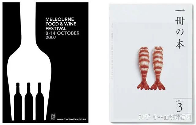
On the left, while leaving it blank, the negative space is used to cleverly combine the theme of the poster, “food” and “wine”. The poster on the right is a design work by Japanese master Kenya Hara, with a large amount of white space to enhance the delicacy of the sushi in the middle, and the few and quiet visual elements enhance the quality of the work.
6. Variations
If some elements change in position, size or color, break the rigid and bland pattern of the layout, make the picture very layered, it is a good way to break the pattern.
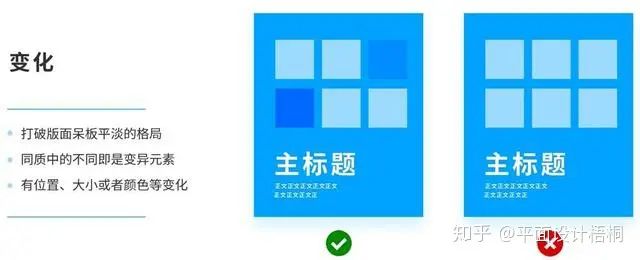
The poster on the left, if all the elements are put in place, will be a composition of the copy and characters separated from the middle distance, and when their positions are shifted a bit, the whole page becomes much more interesting. The poster on the right has an S-shaped composition, and if the circles were the same size and color, not many people would have the patience to read them.
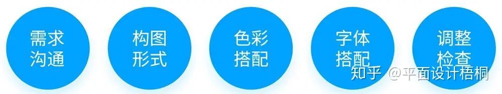
Fourth, the design process
Earlier we learned about the elements of typography, composition and design principles, so how do we use it in our work, the following is my own design process, everyone’s process is different, everyone can adjust according to their own habits.
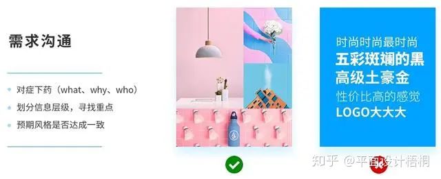
1. Communicate the requirements and confirm the theme
When you receive a demand, the first step is not to rush and start work immediately. First of all, we must find the right direction of demand, in order to improve work efficiency and get twice the result with half the effort. Communication mainly focuses on several aspects:
- What is the purpose of the demand, who is the target user, what is the background?—— the right medicine
- Among so many copywriting or materials, which one is the first and second level?—— divide the information level and find the key points
- What are the requirements or suggestions for style?Can you use 3 keywords to express ?—— whether the expected effect is agreed?
PS: Regarding the style communication in step 3, it is recommended that both parties use pictures to communicate and express. After all, everyone’s understanding of “tall” is different, some people think it is colorful black, and some people think it is a lot of white space. With pictures, we can analyze the reasons why the pictures are “tall”, so as to refine the specific elements and concretize the “feelings”, which is also used in the system of mood board design.
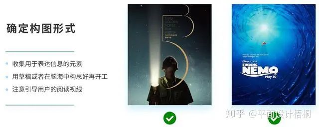
2. Determine the form of composition and learn to guide by sight
According to the previous communication and style keywords, collect the elements used to express the information, including graphics, images, text, etc., and then think about what kind of arrangement can effectively convey the information in the draft or in your mind. In addition, as a designer, you must learn to guide the user’s reading gaze. For example, if you find a model looking up, you can put the copy above the poster, and the user will habitually and naturally follow the model’s line of sight to see the copy.
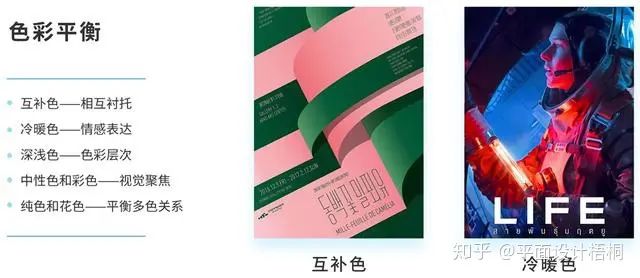
3. Color matching, 5 kinds of balance relationship
Regarding color matching, we can see a lot of methods and theories on the Internet, and the following 5 methods of color balance are introduced to me and I personally think that they are more practical and easy to understand, and we should use the appropriate color scheme according to actual needs.
Complementary colors – complement each other
Complementary colors are two opposite colors on the color wheel, and the green and red in the poster are this relationship, reflecting each other and setting off each other, thus achieving a balance.
Warm and cold colors – emotional expression
When we want to express strong emotions, we can use warm and cold colors to contrast, which is often seen in movie posters or illustrations.
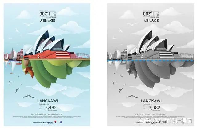
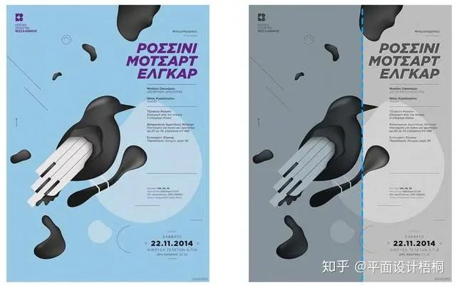
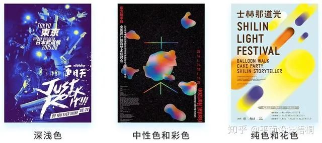
Shades – Gradations of color
The depth here refers to the weight and lightness of the contrast between black, white and gray, generally speaking, the color is large and dark is more important, and the color is small and light is more secondary, we can take a look at the black and white version of the poster that was displayed in the previous composition, and we will find that this rule is more obvious.
Neutrals and colors – visual focus
Neutral colors refer to black, white and gray, also known as achromatic, and when neutral colors are used as background colors, the colored parts will be more prominent and focused.
Solid colors and decors – balancing multi-coloured relationships
If in a picture, the color of the subject itself is rich and bright, and the background color is also colorful, it will be dazzling, which is often called spicy eyes, at this time, a solid background is generally used to relieve visual fatigue and balance the relationship between multiple colors.
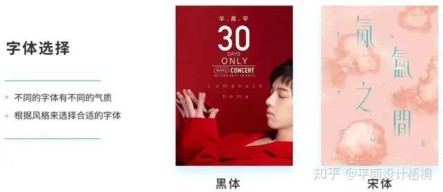
4. Decide on a font pairing
Different fonts have different temperaments, so choose the right font according to the style. If you encounter a good-looking font but don’t know what the name is, you can find some websites that search for words by image, such as Qiuzi.com, etc., to avoid reaching out to the party.
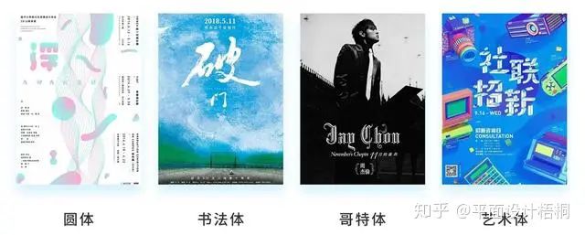
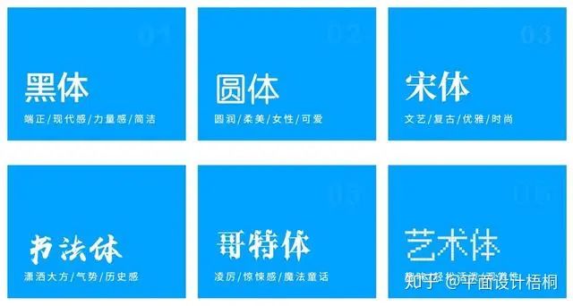
blackbody
The sans-serif font with a strong sense of industrial modernity gives people a sense of uprightness and strength, and is mostly used to express the theme of simplicity or trust.
Songti
The delicate and elegant serif font, slender and slender, is characterized by retro, and is mostly used to express literary or fashionable themes.
Round body
The strokes of the round body are round, soft, cute, and affinity, and are mostly used in the subject area of women or children.
Calligraphic style
The calligraphy style is characterized by being chic and generous, majestic, and has a sense of history, and is mostly used to express traditional culture or historical themes.
Gothic
Gothic is a more decorative serif typeface, with significant thickness variations and ornamentation at the junctions and ends of the lines. It is characterized by sharpness and sharpness, and is mostly used to express the theme of thriller, magic fairy tale or war.
Artistic body
In fact, art style refers to pixel style, handwritten fonts, Hanyi six-character Jane and other fonts with a strong artistic style and design sense. It is characterized by being relaxed and lively, with ornamental and fun.
summary
Finally, to sum up, when we are designing the layout, we should pay attention to constantly adjusting and checking from these aspects, and when you don’t know how to think and analyze when you see a poster, you can also start from these aspects:
- Is the theme distinct, and is the visual focus prominent?
- Is the composition balanced? (3 types of balance)
- Are the design principles used wisely (6 design principles)
- Is there a lot of detail? Is it interesting? The details test the designer’s feelings. (fonts, colors, light and shadow, etc.)
Please indicate:Free Editor Online Photoshop » Why do you always have no ideas when it comes to graphic design, Photoshop layout design? Take you to analyze the layout rules

 Gender Double Label Revealed 9 Illustrations Reveal the Invisible Rules Around Us!

Login to comment! If you already have an account, please first log in,No please registered or