

The < blockquote > icon is one of the most critical parts of the UI page. It is a visual language, representing information, content and revealing the meaning behind the function.
Share the 55th article of < div > clip
Icons should use simple visual metaphors to make users understand and recognize them quickly.
Good icons will also give the product unique personality. Here are 8 simple and practical design suggestions, which can be directly applied to daily design
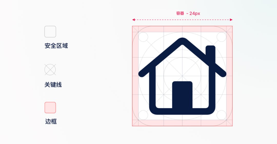
1. Set grid
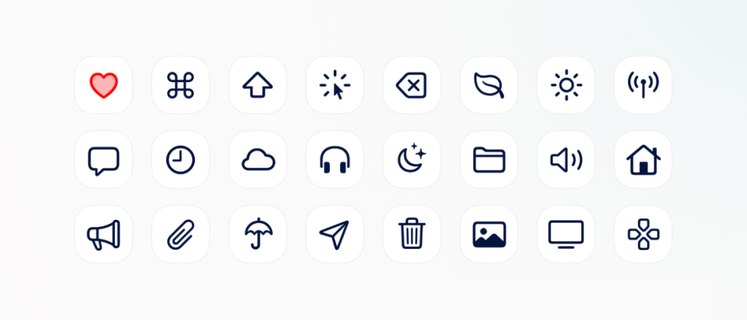
Usually we design a group of icons instead of a single one. In order to make the whole set of icons more uniform, we first need to set up a grid.
Define the security zone and set the key line < / b >, use the same border as the template to maintain the scale and size of all icons.
2. Be consistent
When designing icons, use the same < b > stroke, fillet and fill styles < / b >, to ensure that the icons look more uniform and easy to identify.
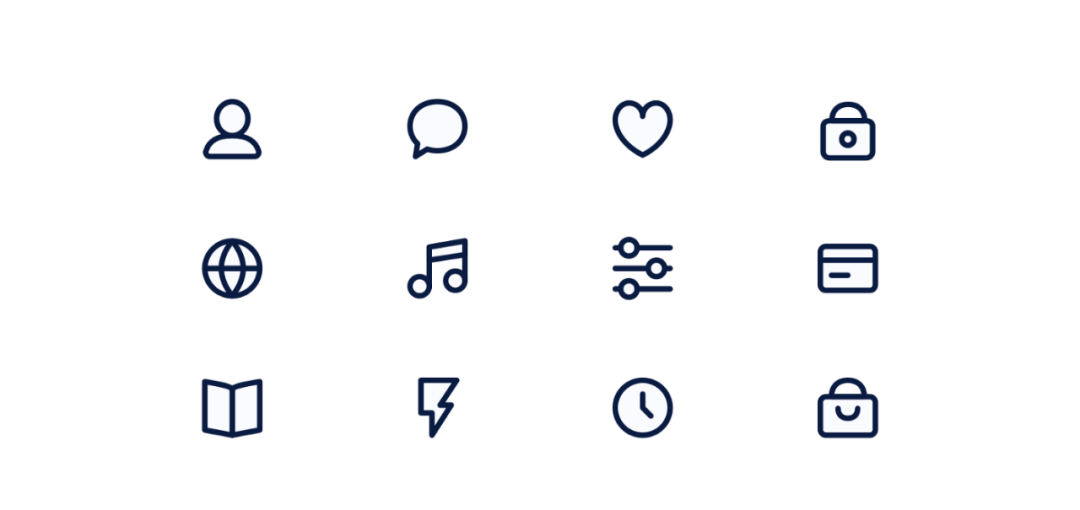
A group of icon design with 2px stroke and 3px fillet.
3. Specify
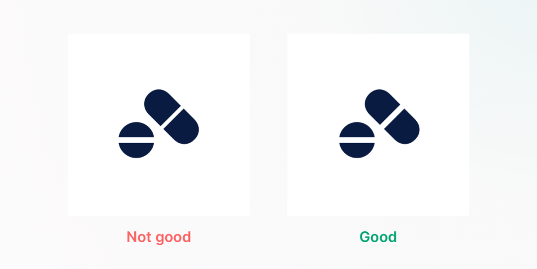
In icon design, less is more. Use clear metaphors and limited details to make each icon easy to identify and understand.
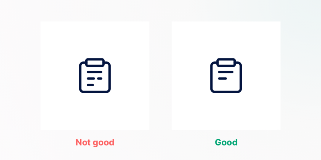
The more details, the better. < / b > on the contrary, we should keep the most concise on the basis of clear expression.
4. Use the same spacing
Using the same spacing between icon elements can make the icon look harmonious.
Tips: < / b > hold down ALT key in figma, sketch and XD to display the distance between elements.
5. Visual alignment
You can’t just rely on the software to align the icons. More often, you need to balance the weight of the icons and keep the < b > visual alignment < / b >.
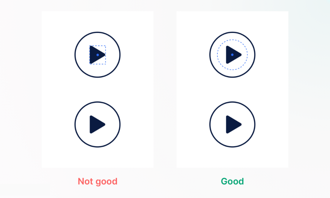
The most common example is < b > play icon < / b >. The visual effect of center alignment is not good. You need to move the play icon to the right to keep balance.
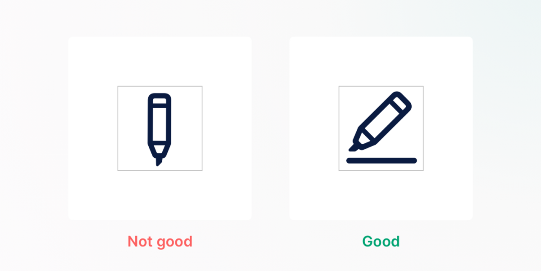
6. Fill in the blanks
The readability of the icon can be improved by rotating the narrow style icon to fill the whole container.
7. Combination style
Use the combination of planar and linear icons to < b > describe the state of the page < / b >, to help users find the right icon or button.
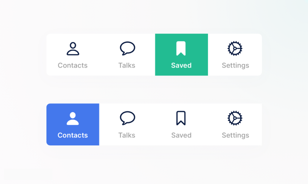
In the navigation bar at the bottom of the app, the area icon is usually used to represent the selected state, and the linear icon is used to represent the unselected state.
8. Icon resources
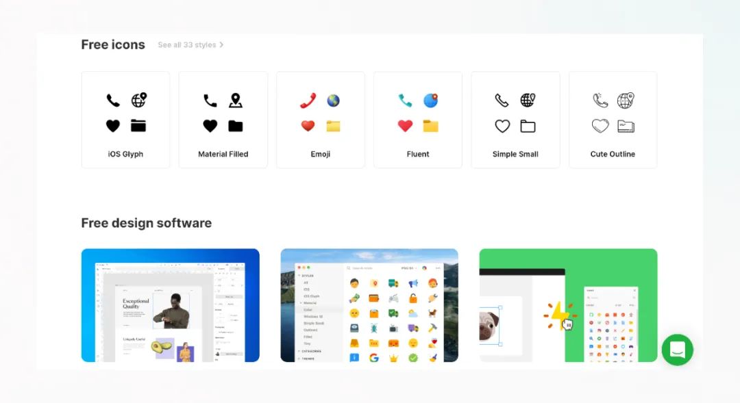
Icons8.com < / b > – with massive icons, illustrations and photos, it is easy to use
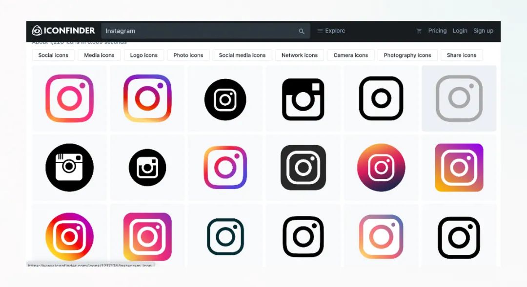
iconfinder.com Good design icons
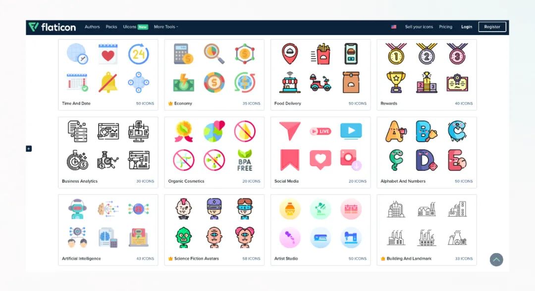
flaticon.com < / b > — a material library with more than 3 million free icons
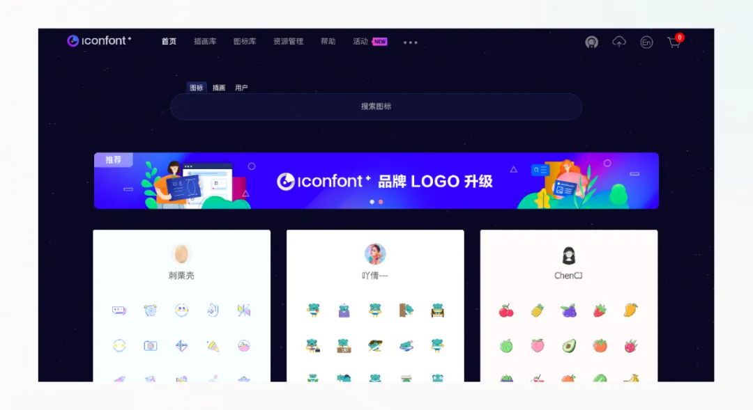
iconfont.cn < / b > — vector icon library created by Alibaba experience team
Please indicate:Free Editor Online Photoshop » 8 practical tips to improve the details of icon design


 Gender Double Label Revealed 9 Illustrations Reveal the Invisible Rules Around Us!

Login to comment! If you already have an account, please first log in,No please registered or