
< / I > < / b > < I > < b > content introduction < / b > < / I >
Like the title of the article, this article is the welfare of Virgo designers, mainly about “how to design visually balanced icons, correct shape alignment, and perfect fillet processing methods.” Multi map warning</ i>
Eyes are strange organs. They often lie to us. However, if you understand the particularity of human visual perception, you can build a more approachable and cleaner design. Not only can font designers use optical techniques to create readable and balanced fonts, but also it is very helpful for interaction designers to build human-computer interaction interfaces.
1. Balanced visual weight
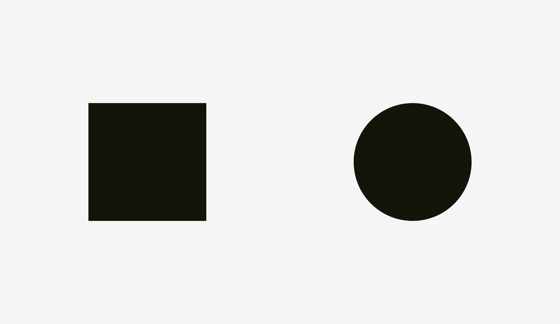
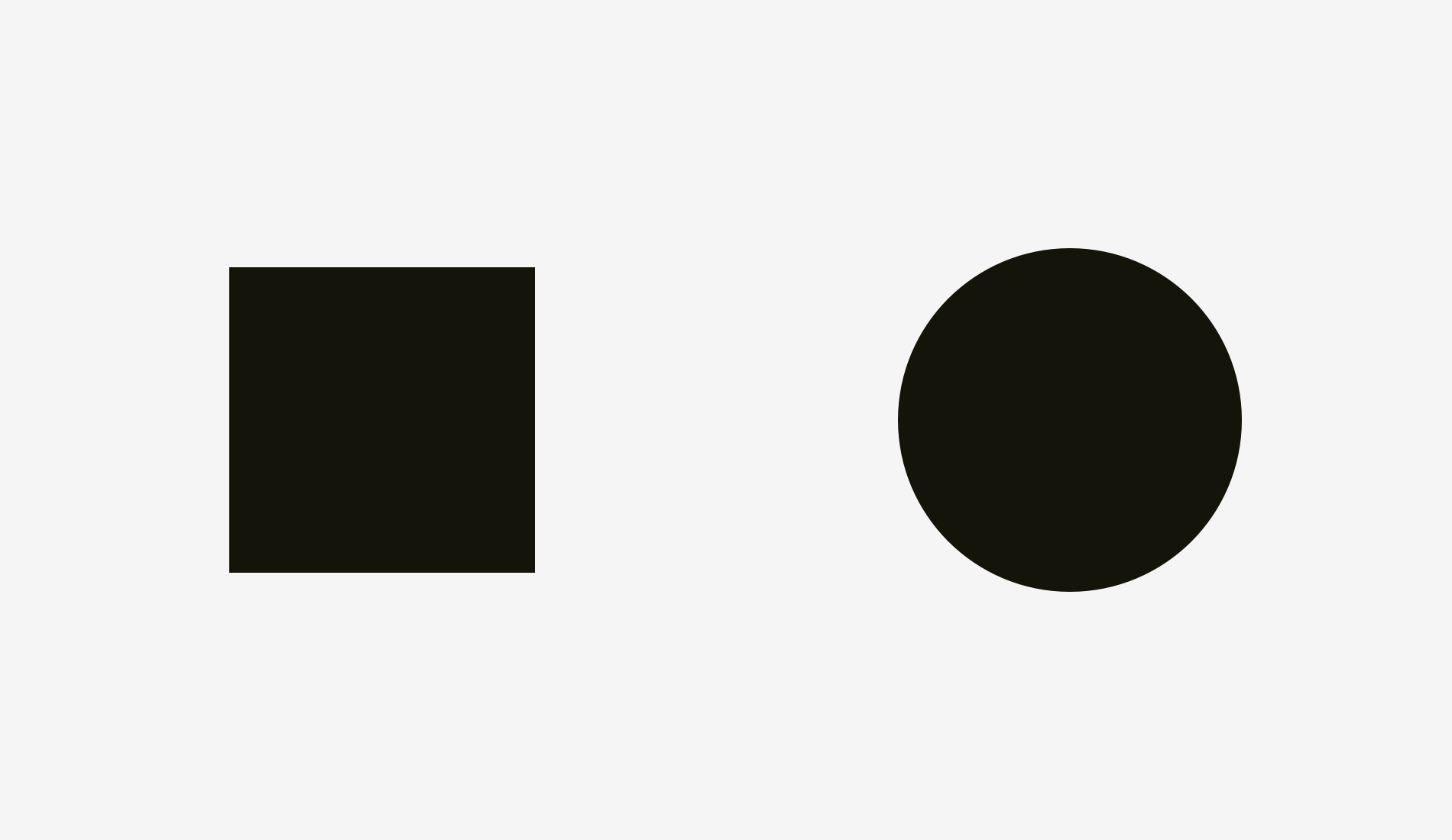
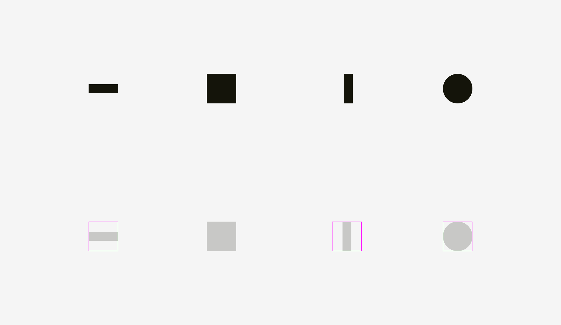
Which is bigger: a 400 pixel square or a 400 pixel circle? Geometrically, their width and height are equal. But look at the picture below. Our eyes immediately found that the square was heavier than the circle. By the way, words related to weight are more suitable for describing visual effects.
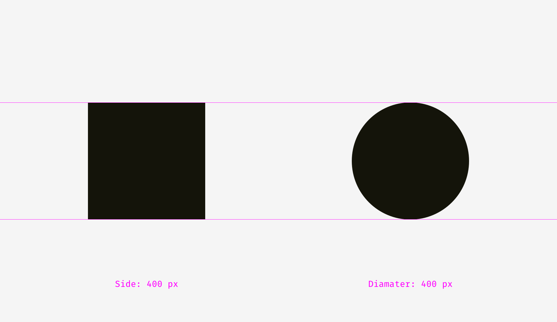
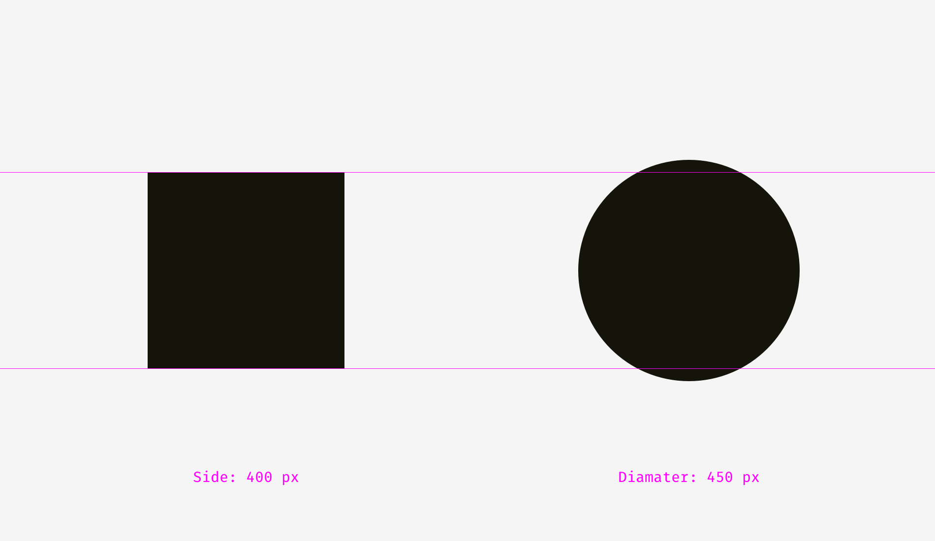
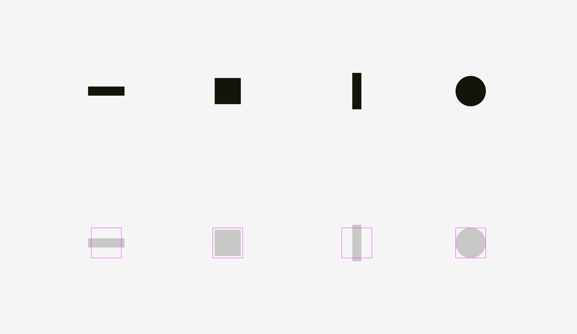
If you don’t believe we draw these shapes accurately, here’s a version with reference lines and numbers.
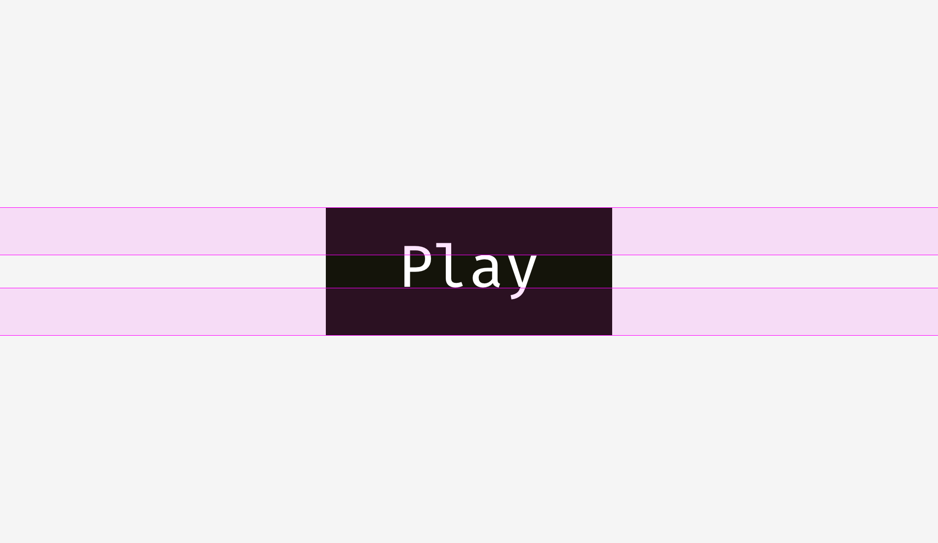
Let’s look at a picture of a square and a circle. Are they equal in visual weight?
For me, it must be. At least it’s hard to tell which one surpasses the other. Not surprising, because I increased the diameter of the circle by 50 pixels.
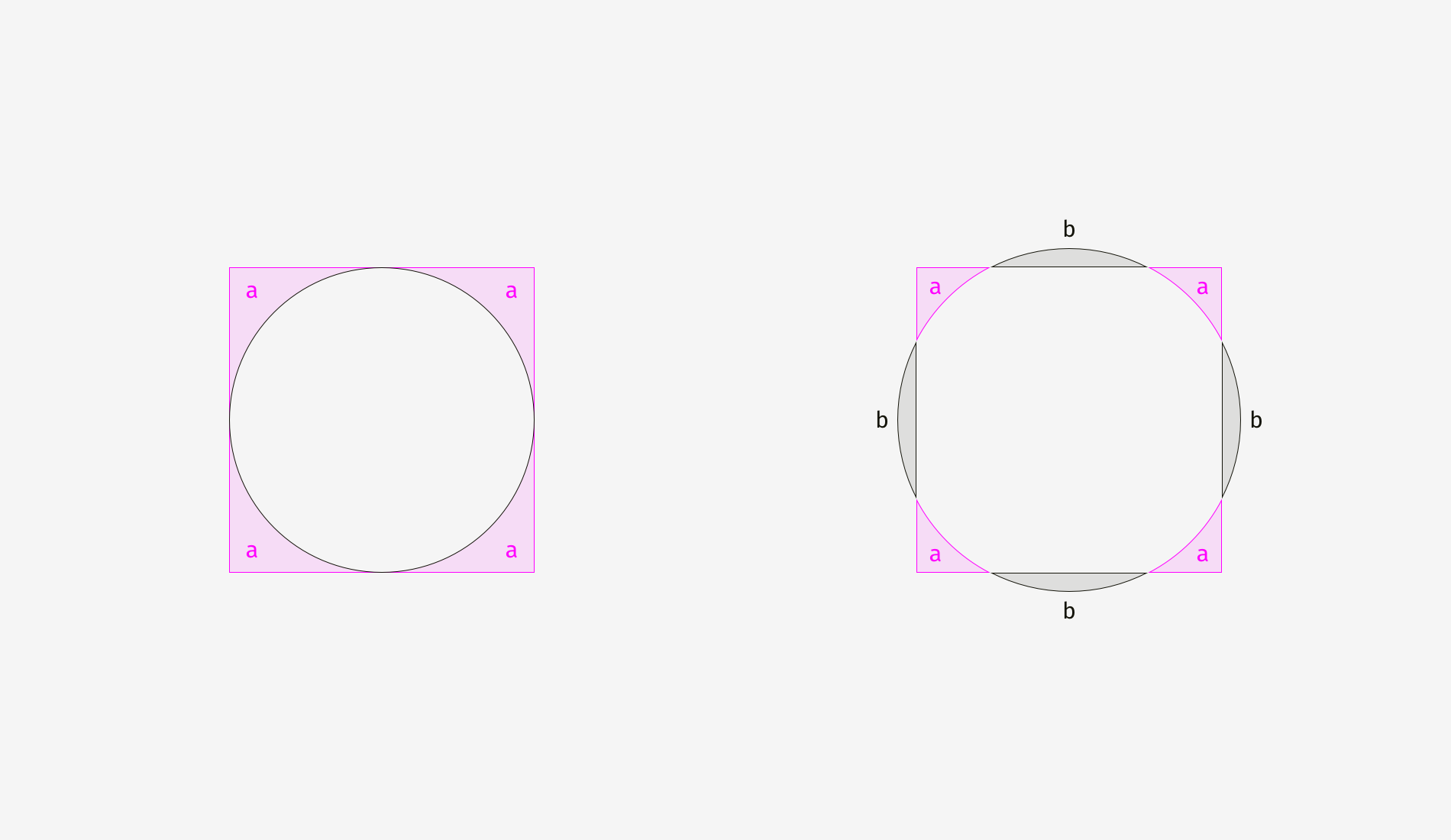
To illustrate why this happens, I overlapped the shapes of the first example (400 pixel square sum circle) and the second example (400 pixel square sum 450 pixel circle). As shown in the figure below, those whose squares exceed the circle are in the “a” area, while those whose circles exceed the square are in the “B” area. In the picture on the left, the square completely contains circles. In the right picture, the circle and the square are balanced; No one contains another; Each of them has four loose parts. Basically, on the right, the shapes have similar areas, but their widths and heights are different.
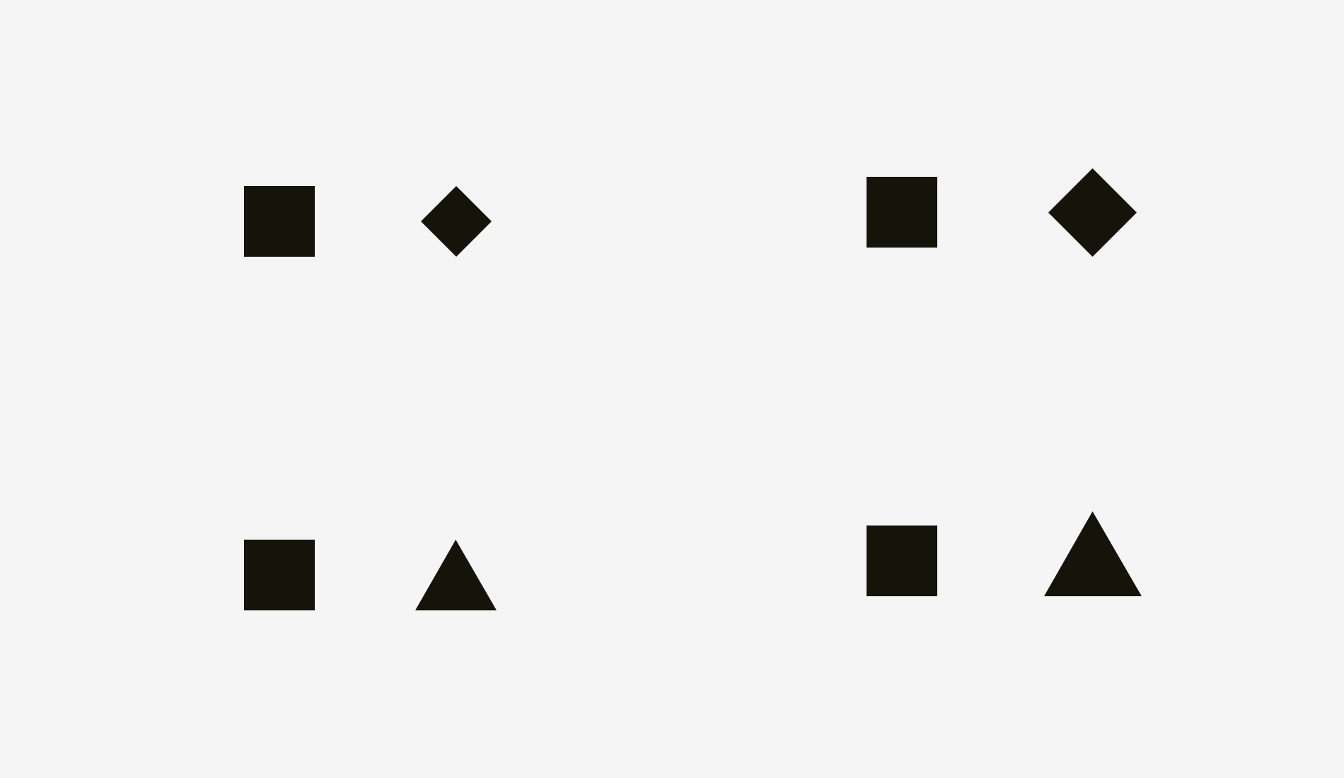
We can also find the same visual effect on diamonds or triangles. In order to balance the visual balance with the square, they should be wider and higher so that their face bases are similar. Simple shapes can be visually balanced by surface based similarity.
How to use this principle in the interface</ b> For example, when designing a set of icons, it is important to make them visually balanced so that the icons do not look too large or too small. If we engrave the icon directly in the square area, the icon with a more square shape will look larger.
I suggest compensating for the weight of icons of different shapes by extending visually smaller icons beyond the icon area, while visually heavier icons leave some space between the icon areas.
Below is the icon of visual balance.
Now it’s clear why an icon area is always larger than an icon body – just to ensure that non square icons fit it and don’t look smaller than square icons.
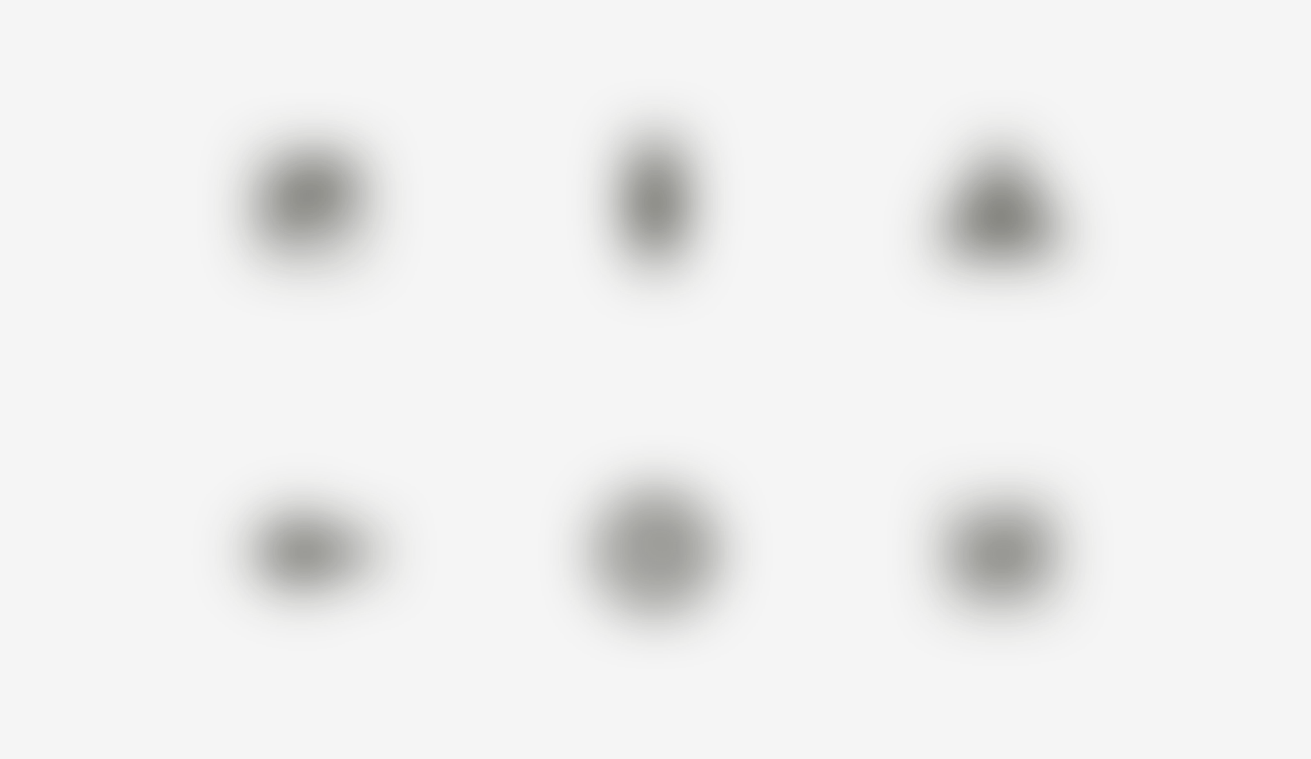
The simplest test to check visual balance is fuzzy icon. If your icons become more or less similar spots, they have the same visual weight.
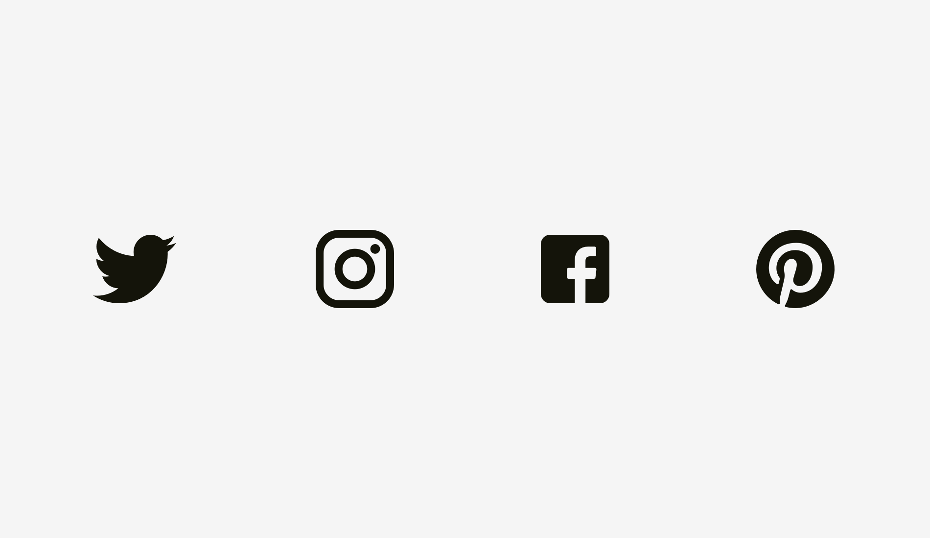
But sometimes we can use existing graphics, such as sharing and liking in social applications. Facebook and instagram icons are square, while Twitter is represented by a bird’s circle silhouette surrounded by pinterest. That’s why twitter and pinterest icons are a little big, so they look balanced with Facebook and instagram icons.
Another example of a visual balance problem is a text box placed with a round button. If the diameter of the button is equal to the height of the text box, the button will look smaller to our eyes, but if you zoom in a little, the whole structure will become more balanced.
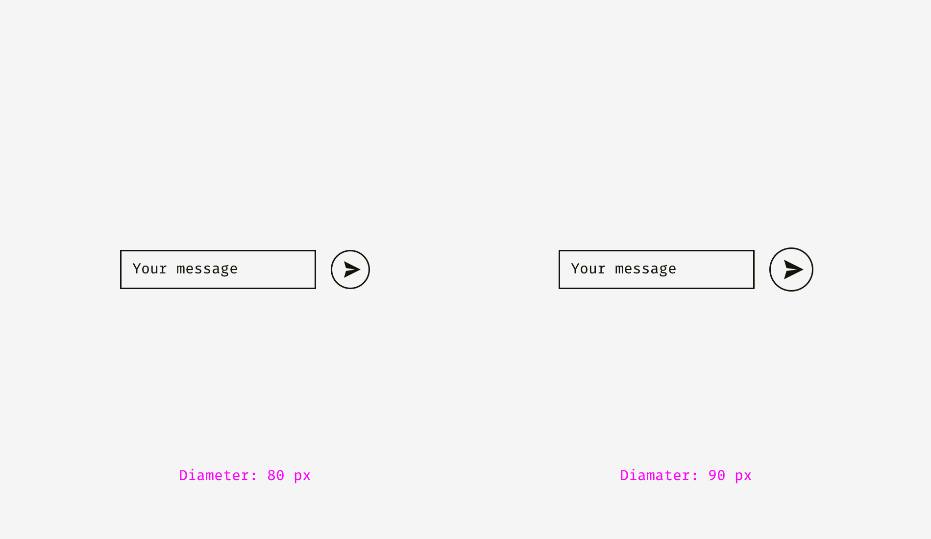
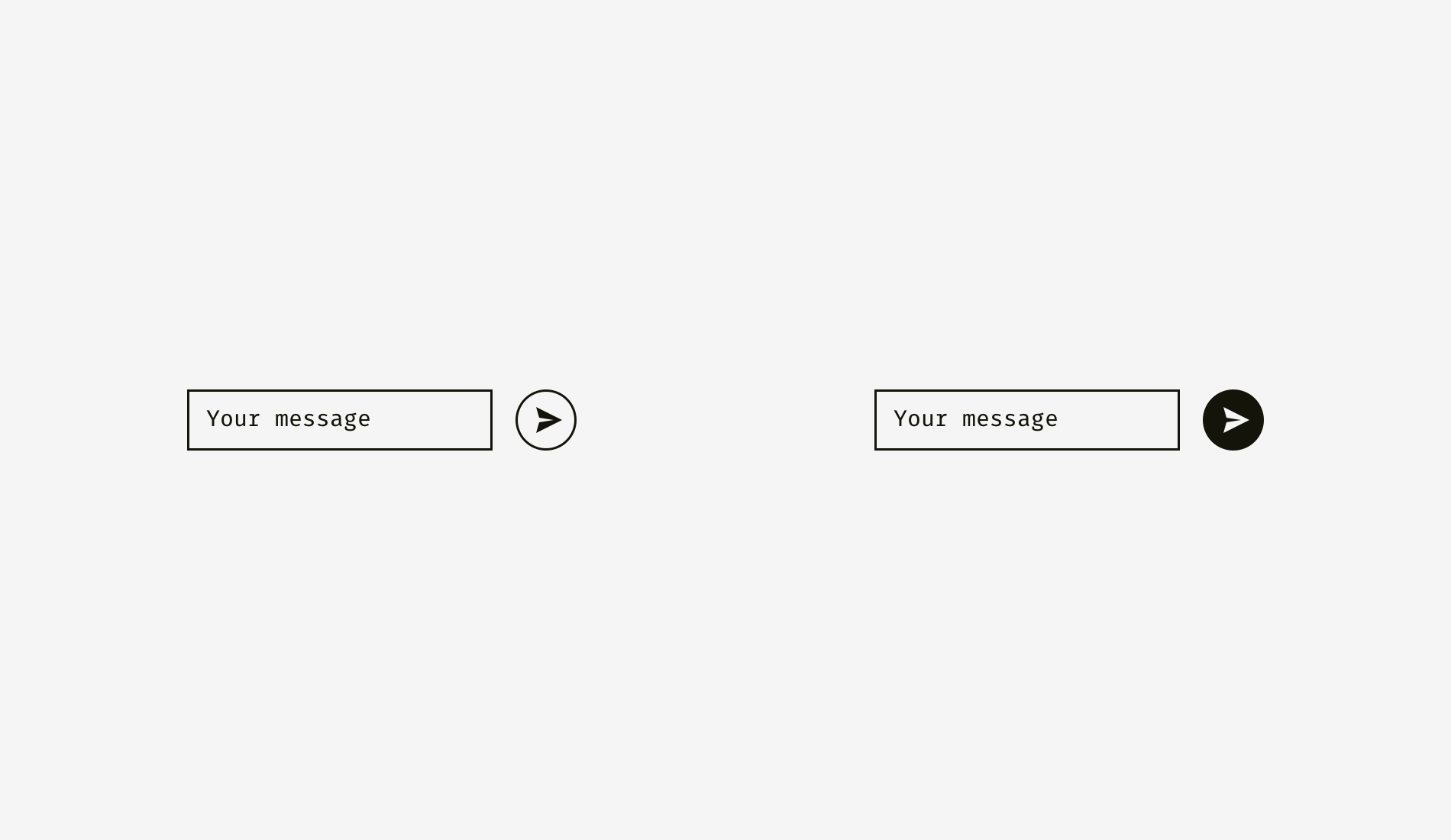
However, if you change the style of the button, you do not need to zoom in. In the figure below, the button and text box are 80 pixels high, but the button on the right will not look small due to the black fill intensity.
Memorize
1. Visual weight depends on how the human eye perceives the size and saliency of the object, not necessarily equal to its pixel size.
2. Circles, diamonds, triangles and other non square shapes need to be larger to visually balance with square shapes.
3. In order to achieve visual balance, a certain space should be reserved in the icon area. This is critical for a set of icons.
2. Alignment of different shapes
Visual alignment is the logical continuation of visual balance and visual weight balance. Look at the stripes below. Do they look the same length?
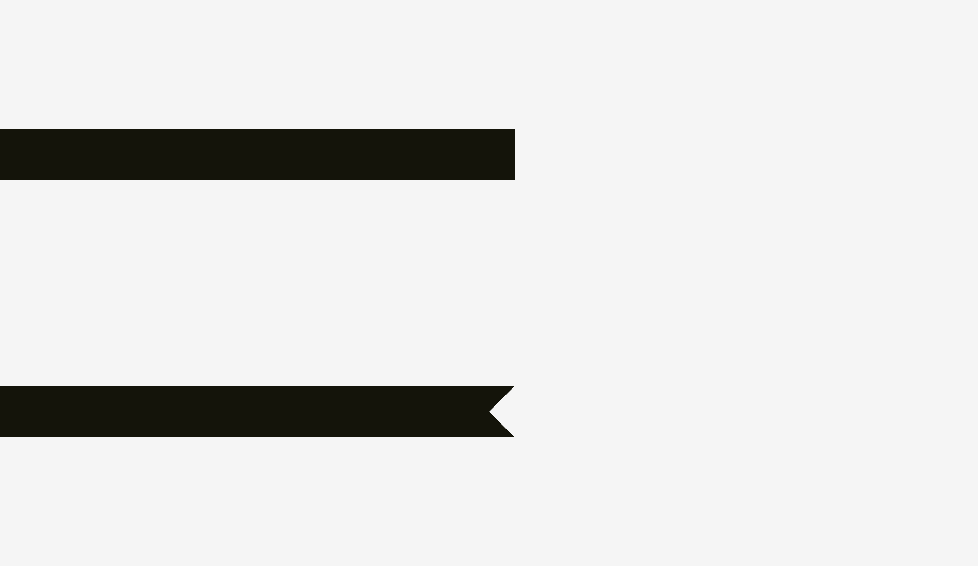
In terms of pixels, the answer is yes. At first glance, however, the lower stripe looks shorter than the upper one.
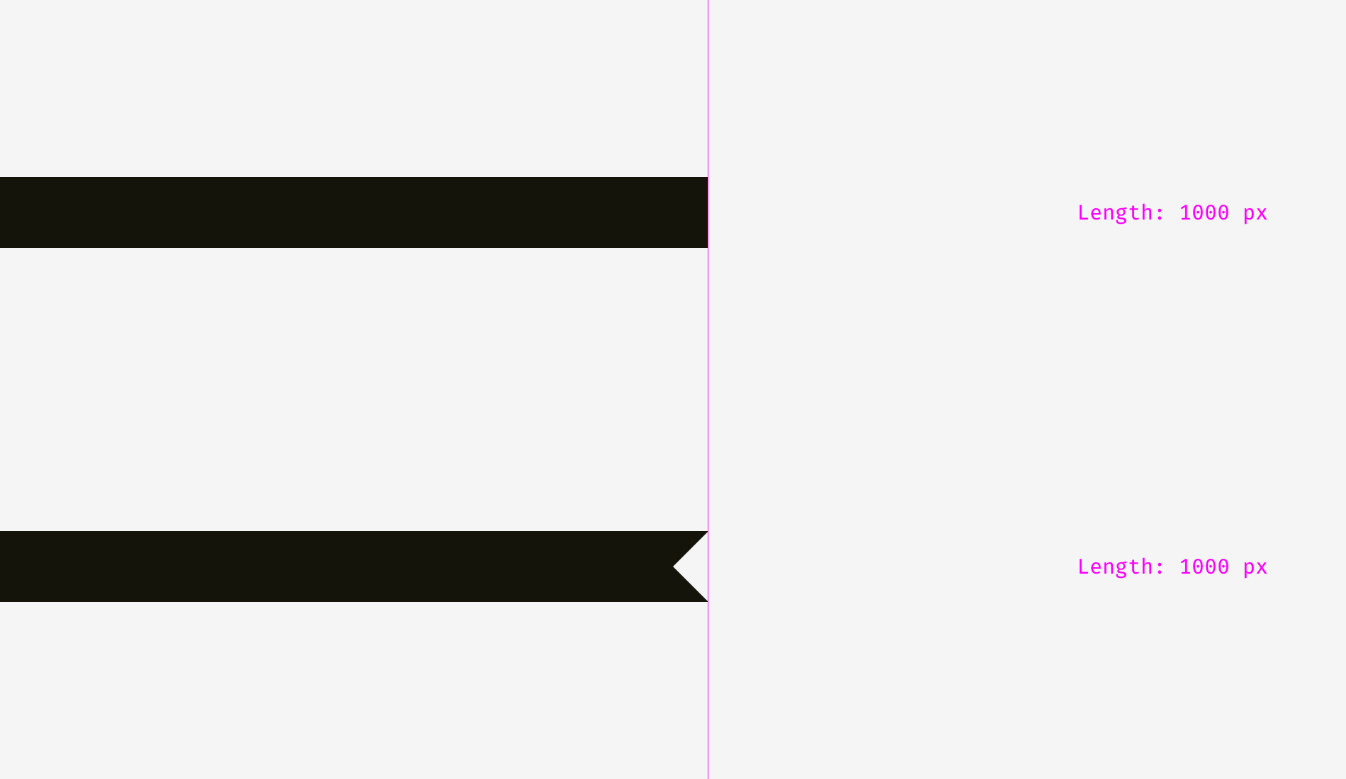
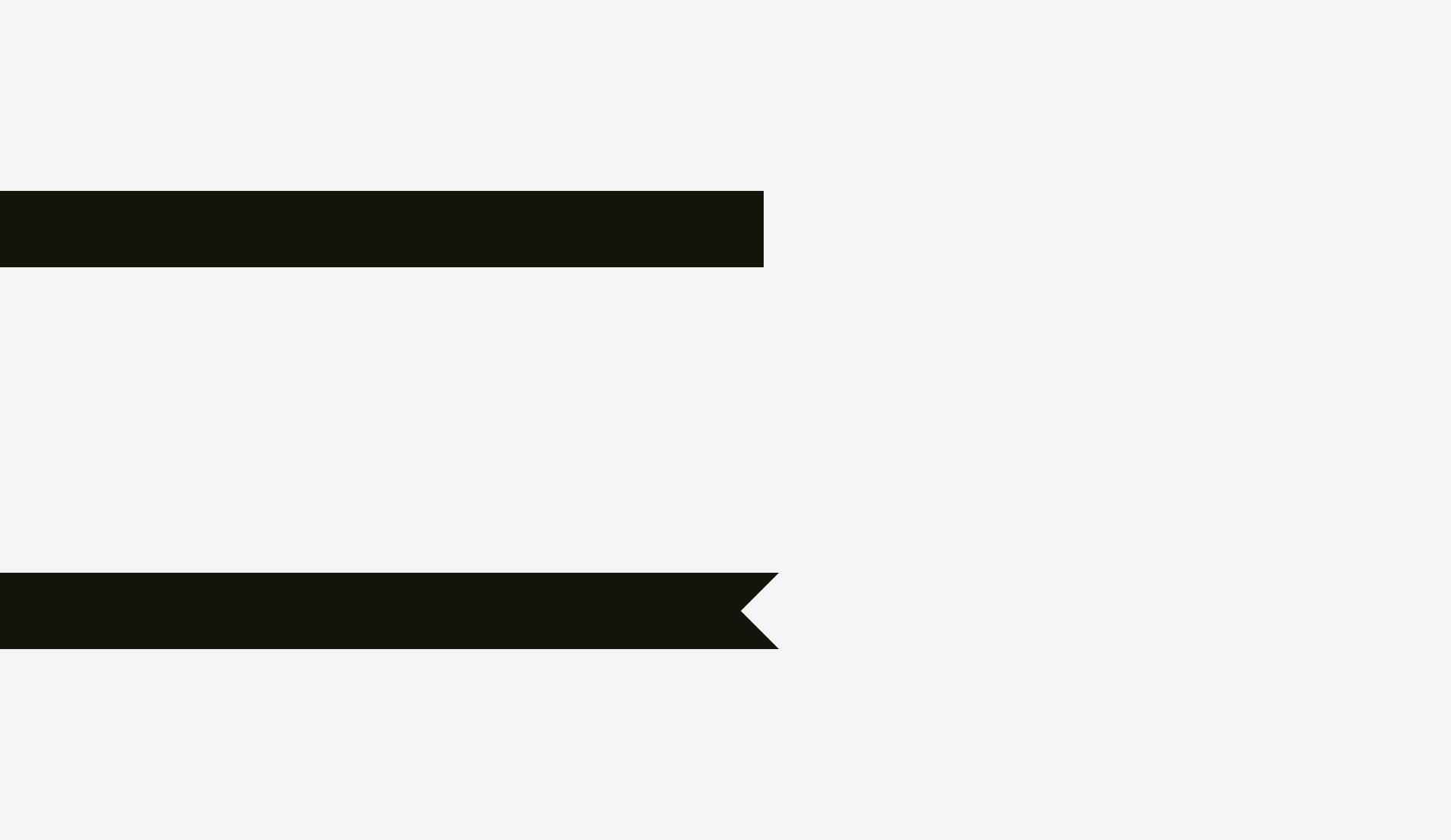
Another two stripes. What has changed?
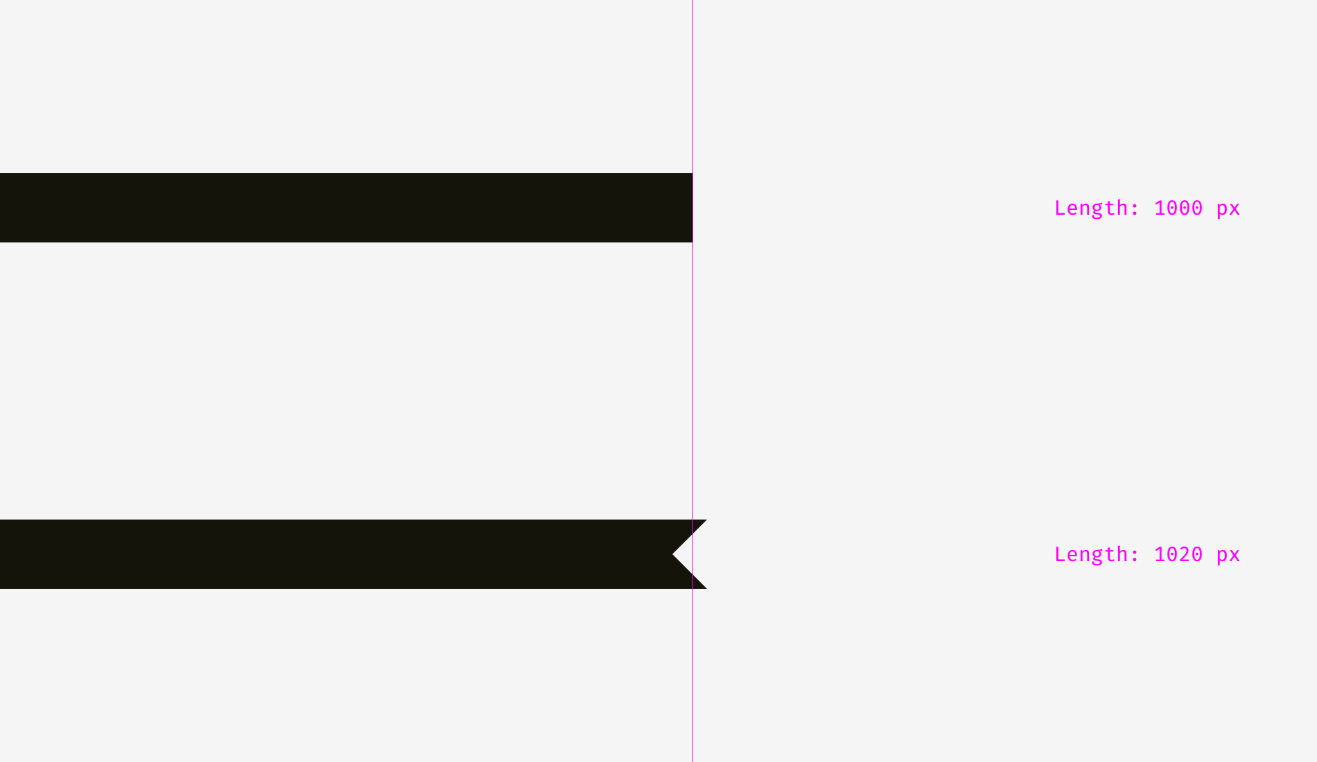
I made visual compensation for the next item. Increase the length of the lower stripe on the original foundation. 20 pixels can compensate for the gap between spikes and make the two shapes visually equal.
Now there are some more complex examples of stripes with different shapes.
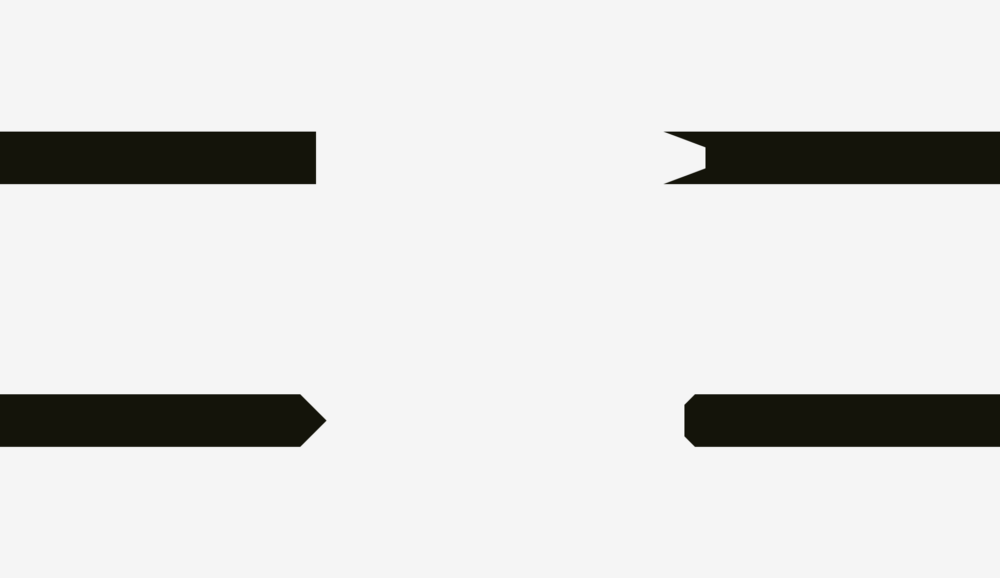
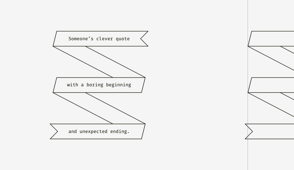
So if you’re creating a poster with folded stripes and text, or if you’re putting bright “discount” stripes on product cards in online stores, remember visual balance. The sharp edge should be longer than the rest of the shape, especially if it is a rectangle.
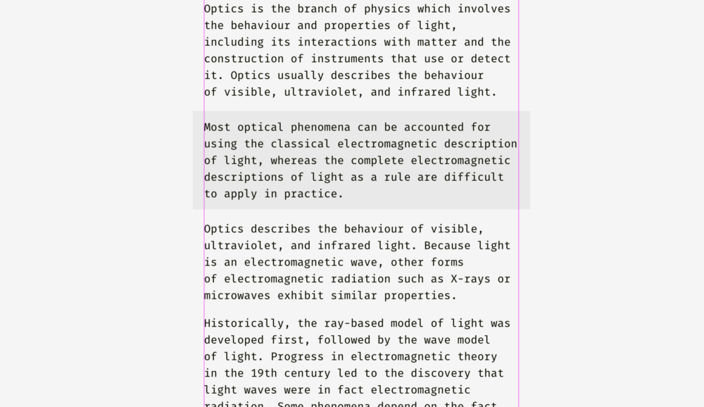
So how do you align plain text and paragraphs with a background? This depends on the visual density of the background. If it’s light, you can align the highlighted paragraph with the rest of the text.
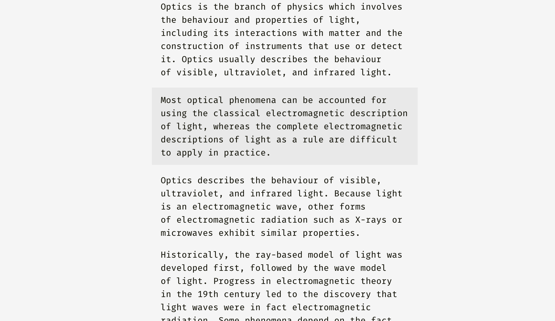
Because the background is very light, it does not interrupt the regular text flow.
Different methods can be applied to dense backgrounds. On the picture, the black background is aligned with the rest of the text, while the white text is indented.

Unlike the light background, black has great visual weight. If the target is to insert a segment seamlessly, it is best to align it as shown in the figure below.
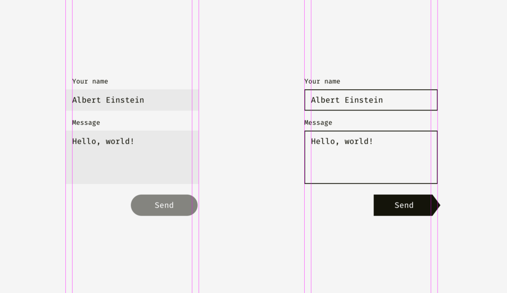
The same principle applies when buttons and input boxes are used together. Of course, this is not a dogma, but a visual interface layout.
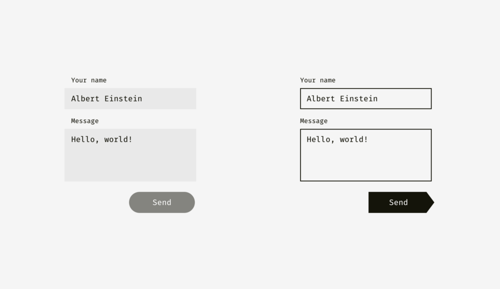
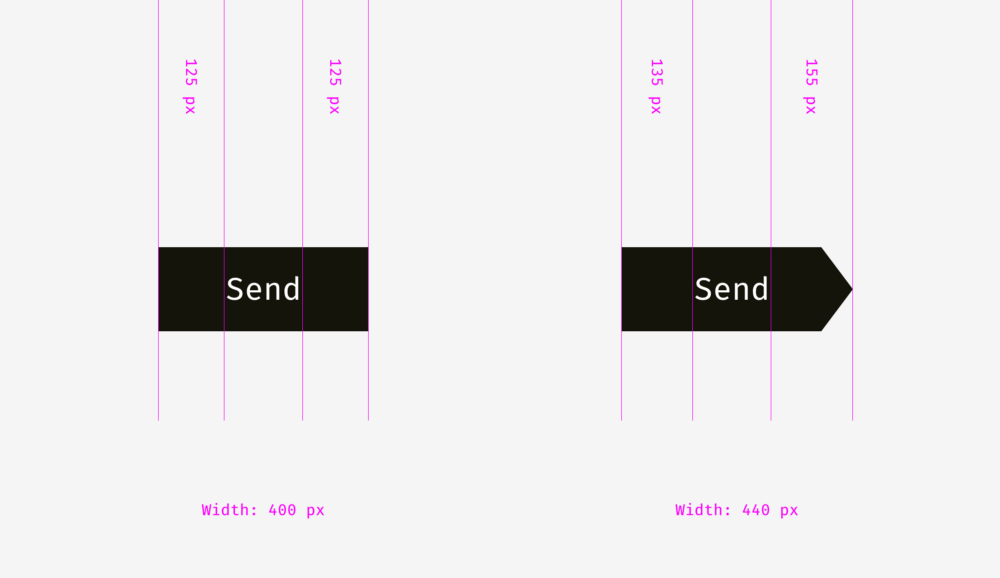
The light background of the left input box can exceed the label and user input. The right edge of the send button is not fully aligned with the right edge of the input background because the button is darker and visually heavier.
On the right, the input boxes have solid borders, and we align them with the labels, while the text entered by the user is indented. The send button has a triangle. And move the button to the right to balance with the above rectangular input box.
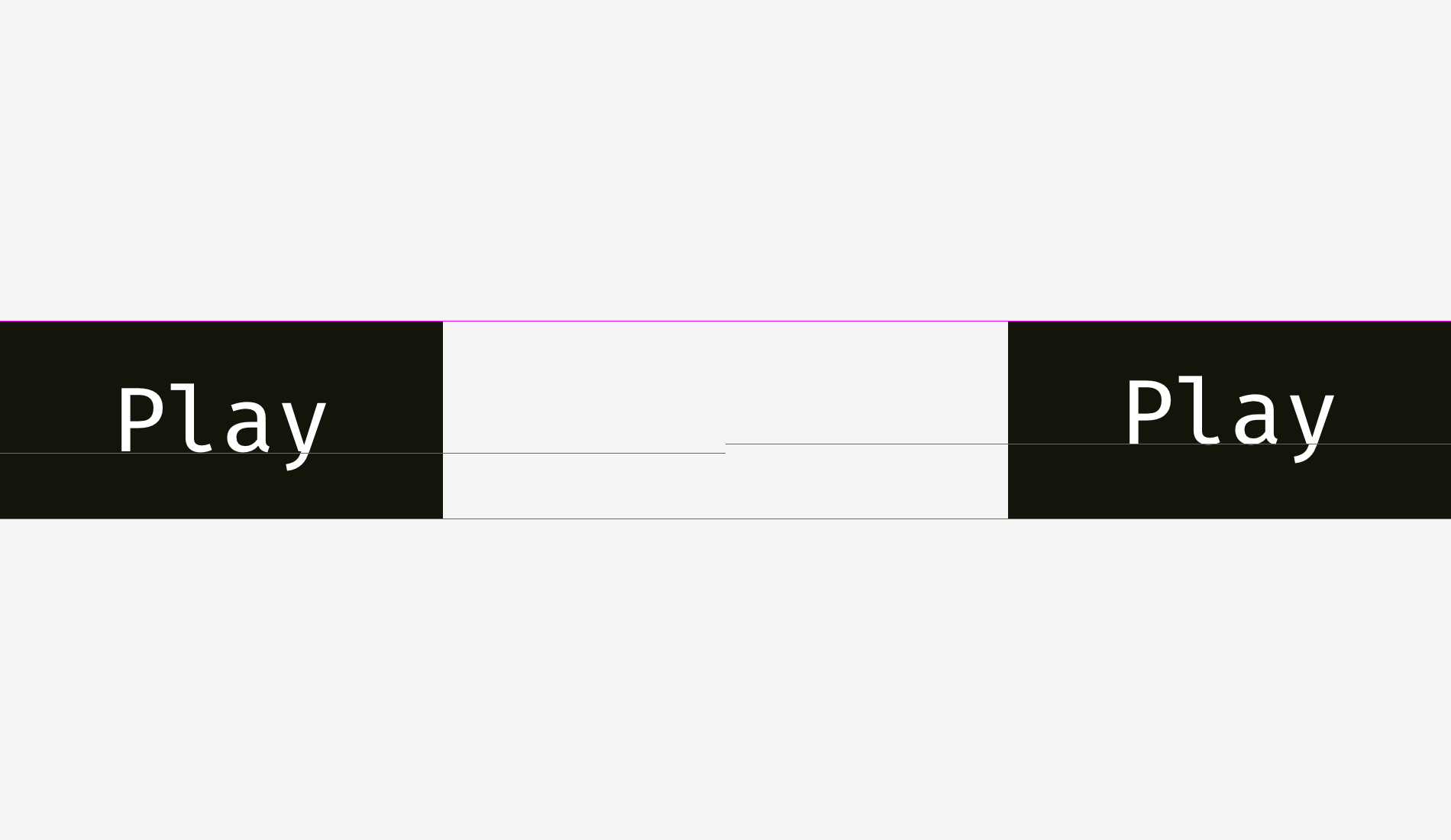
Here, we are gradually approaching another level of it – the alignment of text and icon buttons. Look at the buttons below. The text looks centered, doesn’t it?
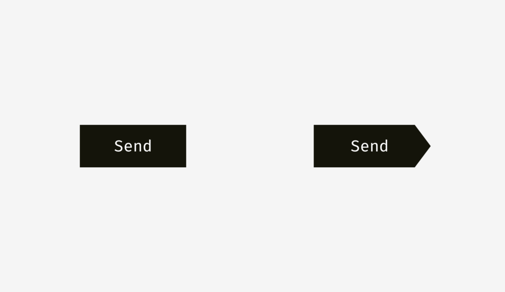
The trick is that the button on the right moves the copy a few pixels to the left, because the right is triangular. In addition, the width of the arrow button is 40 pixels, which looks similar to that of a rectangle.
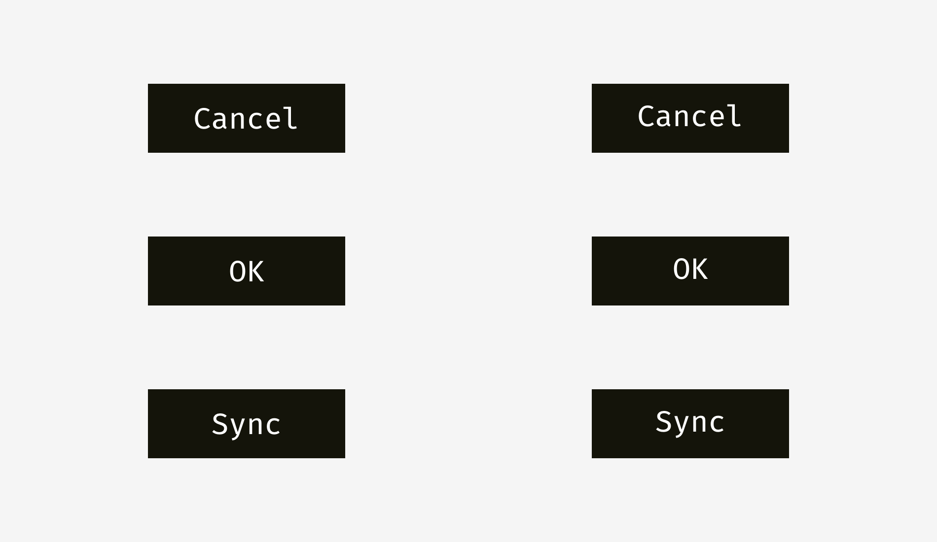
Text buttons have not only horizontal alignment, but also vertical alignment of words and background. The first method I mentioned is applicable to the interfaces of various operating systems, sites and applications. It is an alignment based on the height of the font’s capital letters (the so-called capital letter height). It is equal to the height of “H” or “I”.
Basically, the spaces above and below the capital letters and the edges of the buttons are equal. This makes sense because the command name is usually in the title format, and the English letters have a lot of rising – the upper protruding part (L, t, D, B, K, H) – than the falling part – the lower hanging part (y, J, G, P).
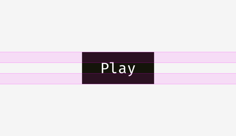
Another method is to align the name and background based on the height of the lower case letters of the font (so-called x-height). In serif and non serif interface fonts, ensure that the font height is equal to the height of the letter “X”.
This method also makes sense because the visual weight of the text is mainly concentrated in the area where lowercase letters are placed.
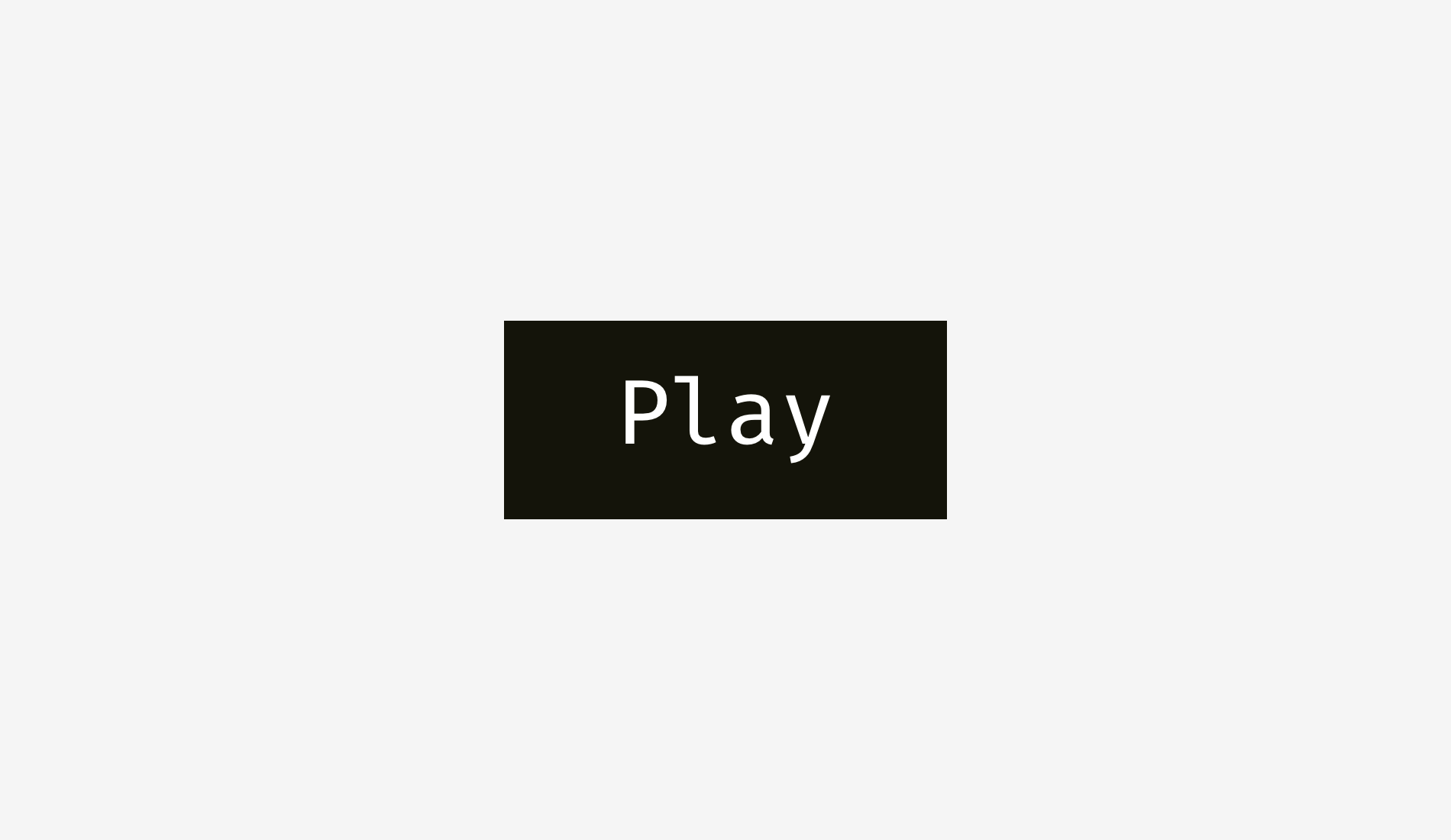
What is the difference between these methods? Yes, there is a difference. However, this is not big.
Here are more examples. The upper case method shown in the left column is better for “Cancel” and “good” – such a widely used button – because “Cancel” does not drop, and “OK” is capitalized. The x-height method shown in the right column is only applicable to the “sync” button, and its name has upper and lower protruding elements; The words “Cancel” and “OK” seem to be placed too high.
The situation of icon buttons is slightly different. Let’s put a popular “send” icon on a circular button. Which variant looks more balanced?

I hope you’ve noticed something wrong on the left. This is because of the different alignment. The image on the left treats the icon as a rectangle. To some extent, this is correct because when you send an SVG or PNG file to a developer, it is a rectangular paper with an icon. The adjustment on the right shows all sharp edges to make them equal to the background of the round button.
Please indicate:Free Editor Online Photoshop » Visual alignment of user interface (Virgo welfare)


 Gender Double Label Revealed 9 Illustrations Reveal the Invisible Rules Around Us!

Login to comment! If you already have an account, please first log in,No please registered or