

< blockquote > when creating an icon, we will consider the composition, thickness and color of the icon, which will be accurate to every pixel, so that the icon will look more delicate</ blockquote>
In fact, we should not only master these design techniques, but also pay attention to the basic principles of design. Master the basic principles of icon design, techniques can be better implemented.
Share the 52nd article of < div > clip
1. Simplicity </ b>
The design of the icon should be as concise as possible on the basis of meeting the basic meaning expression. A good icon should be easy to understand without additional text.
Excessive pursuit of beautiful screen may cause users not to understand the information to be expressed by the icon, increase the probability of user’s wrong choice, and increase the development cost.
In general, the fewer elements an icon contains, the better< b> Too much element accumulation will cause the lack of difference between icons</ b>

Too much detail may not make the icon clearer, on the contrary, it will give users a sense of fragmentation.
2. Clarity </ b>
If icons are more difficult to understand than words, what is the significance and value of their existence?
< H4 > < b > metaphor < / b > < / H4 >
Good icons are universal for people of different cultures and backgrounds.
Appropriate metaphors ensure the clarity of the icon < / b >. Through the common cognitive language, users can understand, operate and quickly obtain information.

▲ Common < b > search, shopping cart, folder < / b > and other icons use physical objects as metaphors, which can make the design more effective.
< H4 > < b > simplify < / b > < / H4 >
The readability of icons is important< b> Sometimes simplicity doesn’t guarantee clarity, because over simplification can make icons ambiguous</ b>
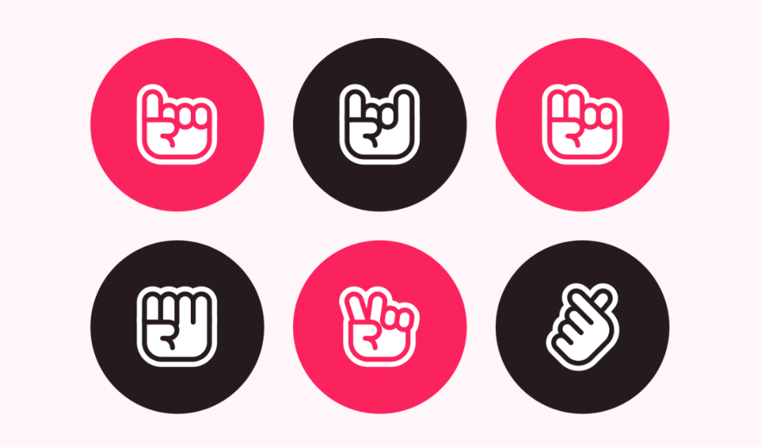
▲ The design of this group of icons has the problem of over simplification. Although the unified design style is maintained, the expression of internal elements is not clear.

▲ The icon uses a unified color matching and basic graphics, the visual style is very attractive, but it is difficult for users to quickly distinguish the meaning of each icon.
< H4 > < b > size < / b > < / H4 >
The size also affects the recognition of icons. The more small elements in an icon, the more difficult it is to understand what it conveys.
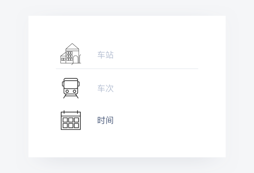
▲ Through the comparison, we can find the problems of station Icon: the icon size is too large; There are too many small details; The lines vary in thickness. These are the reasons why the icon is not clear.
3. Unity </ b>
Each app contains a lot of icons, < b > unity refers to the increase of recognizable changes according to different functions on the basis of unity and coordination</ b>
< H4 > < b > brand requirements < / b > < / H4 >
Icon design to meet the requirements of the product, should be consistent with the style of the whole product or brand, to ensure the overall sense and consistency of the icon.

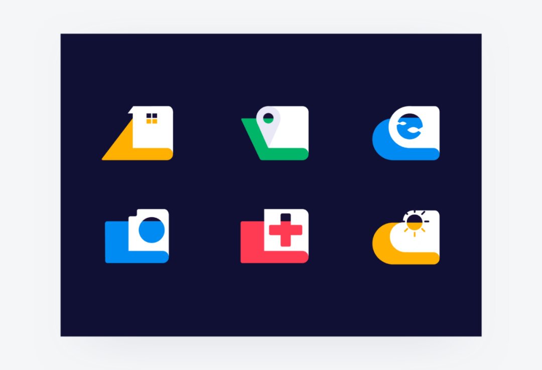
▲ Google’s updated icons have a highly unified appearance and color matching, which not only visually but also psychologically reflect the essence and value of the brand.
< H4 > < b > design requirements < / b > < / H4 >
Icon to maintain the consistency of the appearance of elements, including shape, color, etc< b> There should be a clear degree of recognition < / b > while there is correlation between icons, so as to reduce the memory burden of users.
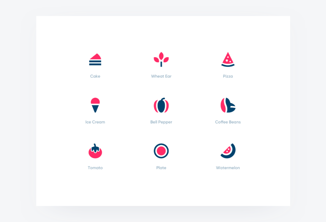
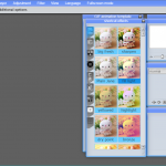
▲ This group of fruit theme icons adopt a unified style, and the graphic changes have a unified dynamic rhythm. This consistency makes the perception of icons easier and contributes to the enthusiasm of the user experience.
Unity does not mean the same</ b> But on the basis of style unification, we seek for association and change.
4. Uniqueness </ b>
On the basis of meeting the previous principles, in order to distinguish from other icons, we can pursue the visual uniqueness and expressiveness of icons.
Uniqueness doesn’t mean that you need to create an icon that you haven’t seen before. Instead, you need to use familiar metaphors and infectious expression methods to highlight the visual effect and realize the creativity and design style perfectly.
▲ The use of 3D icons makes the interface very expressive. It should be noted that interesting or interesting icons will give users a sense of freshness, but not all users can easily understand or operate them.
last </ b>
The birth of an icon needs to constantly polish and improve every small detail, and also needs to follow the basic principle of simplifying, so as to ensure that the icon is clear, beautiful and practical.
Please indicate:Free Editor Online Photoshop » What basic principles should icon design follow? I summed up these points!


 Gender Double Label Revealed 9 Illustrations Reveal the Invisible Rules Around Us!

Login to comment! If you already have an account, please first log in,No please registered or